4 Intro to Data Visualization with ggplot2
https://learn.datacamp.com/courses/introduction-to-data-visualization-with-ggplot2
Main functions and concepts covered in this BP chapter:
- (
Factor) Function - New Aesthetics
- Geometries
- Changing One vs Many geoms
- Saving plots as Variables
- Color, Shape and Size
- Color vs Fill
- Comparing Aesthetics
- Size
- Alpha
- Shape
- label (
geom_text())
- Attributes
- Using Aesthetic Labels
- Aesthetic Best Practices
- Overplotting
- Large Data Sets
- Aligned Values
- Low-precision Data
- Integer Values
- Histograms
- Drawing Histograms
- Positions in Histograms
- Bar Plots
- Position in bar and col plots
- Overlapping bar plots
- Bar plots: sequential color palette
- Line Plots
- Basic line plots
- Multiple time series
- Moving the Legend
- Modifying theme elements
- Built-in Themes
- Exploring ggthemes
- Setting Themes
- Publication-quality plots
- Using geoms for explanatory plots
- Using annotate() for embellishments
Packages used in this chapter:
## Load all packages used in this chapter
library(tidyverse) #includes dplyr, ggplot2, and other common packages
## ── Attaching core tidyverse packages ──────────────────────── tidyverse 2.0.0 ──
## ✔ dplyr 1.1.4 ✔ readr 2.1.4
## ✔ forcats 1.0.0 ✔ stringr 1.5.1
## ✔ ggplot2 3.4.4 ✔ tibble 3.2.1
## ✔ lubridate 1.9.3 ✔ tidyr 1.3.0
## ✔ purrr 1.0.2
## ── Conflicts ────────────────────────────────────────── tidyverse_conflicts() ──
## ✖ dplyr::filter() masks stats::filter()
## ✖ dplyr::lag() masks stats::lag()
## ℹ Use the conflicted package (<http://conflicted.r-lib.org/>) to force all conflicts to become errors# used for vocab dataset
library(carData)
# If you run code to create plt_prop_unemployed_over_time, you need lubridate
library(lubridate)
# For the themes chapter
library(ggthemes)
## For the last plot
library(gapminder)
library(RColorBrewer)Datasets used in this chapter:
## Load datasets used in this chapter
# mtcars, diamonds, economics: part of tidyverse package
# vocab: part of carData package
load("data/fish.RData") # fish.species dataset
Note: A few exercises use the mtcars variable fcyl. They added the fcyl variable to mtcars. It is simply the cyl variable as a factor You know how to do this from learning about mutate in the previous BP chapter (i.e., mtcars <- mtcars %>% mutate(fcyl = factor(cyl))). You also need to do the same thing to create fam, which is the factor version of am.
Note2 : Similarly, for the Vocab dataset, you need to convert education and vocabulary to factor, e.g., Vocab <- Vocab %>% mutate(education = factor(education)) and similarly for vocabulary.
Note 3: this BP chapter is on Introduction to Data Visualization with ggplot2, to further your skills (including some that might be useful later in 380), you are free to also explore Intermediate Data Visualization with ggplot2
4.1 Introduction
4.1.1 (Factor) Function
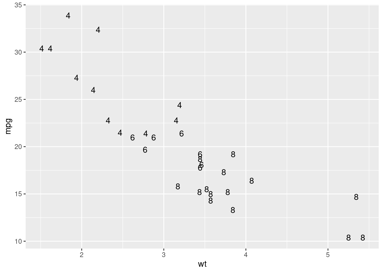
We will start with a standard scatter plot.
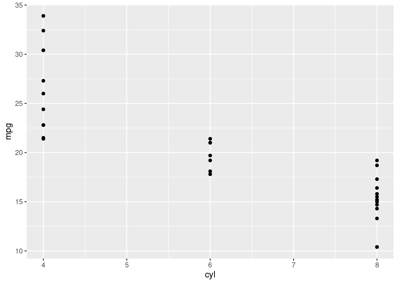
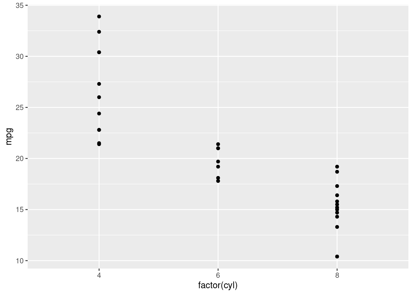
As we can see, there are only 3 values for the cyl variable. Since this variable behaves more like a categorical varible, we can use the (factor) command to treat the cyl variable like a categorical variable.
4.1.2 New Aesthetics
In section 3, we learned about graphing aesthetics, these determine how the graph looks, and what is included in our graph. Here we will start by using the color aesthetic. The inside the aes function, we will put (color = variable), this will be the same format for most of the aesthetics.
# Change the color aesthetic to a size aesthetic
ggplot(mtcars, aes(wt, mpg, color = disp)) +
  geom_point()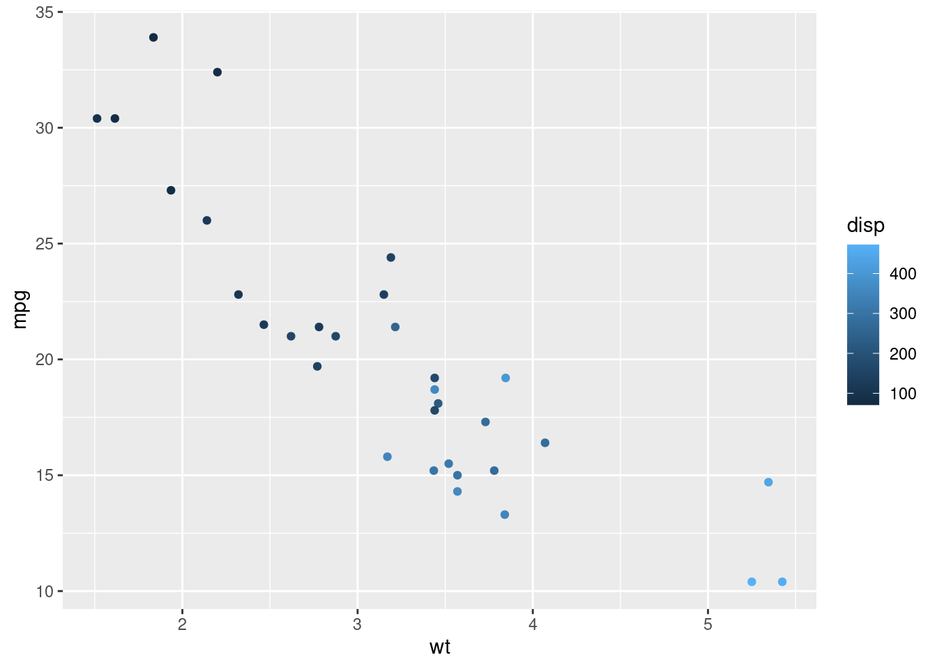
4.1.3 Geometries
When we make a plot in R, we use geometries to determine what visual elements are included on the plot. We will start with (geom_smooth), which adds a smooth curve to a scatterplot
# Add geom_smooth() to a scatterplot with +
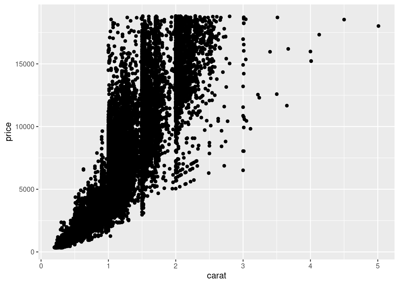
ggplot(diamonds, aes(carat, price)) +
  geom_point() +
  geom_smooth()
## `geom_smooth()` using method = 'gam' and formula = 'y ~ s(x, bs = "cs")'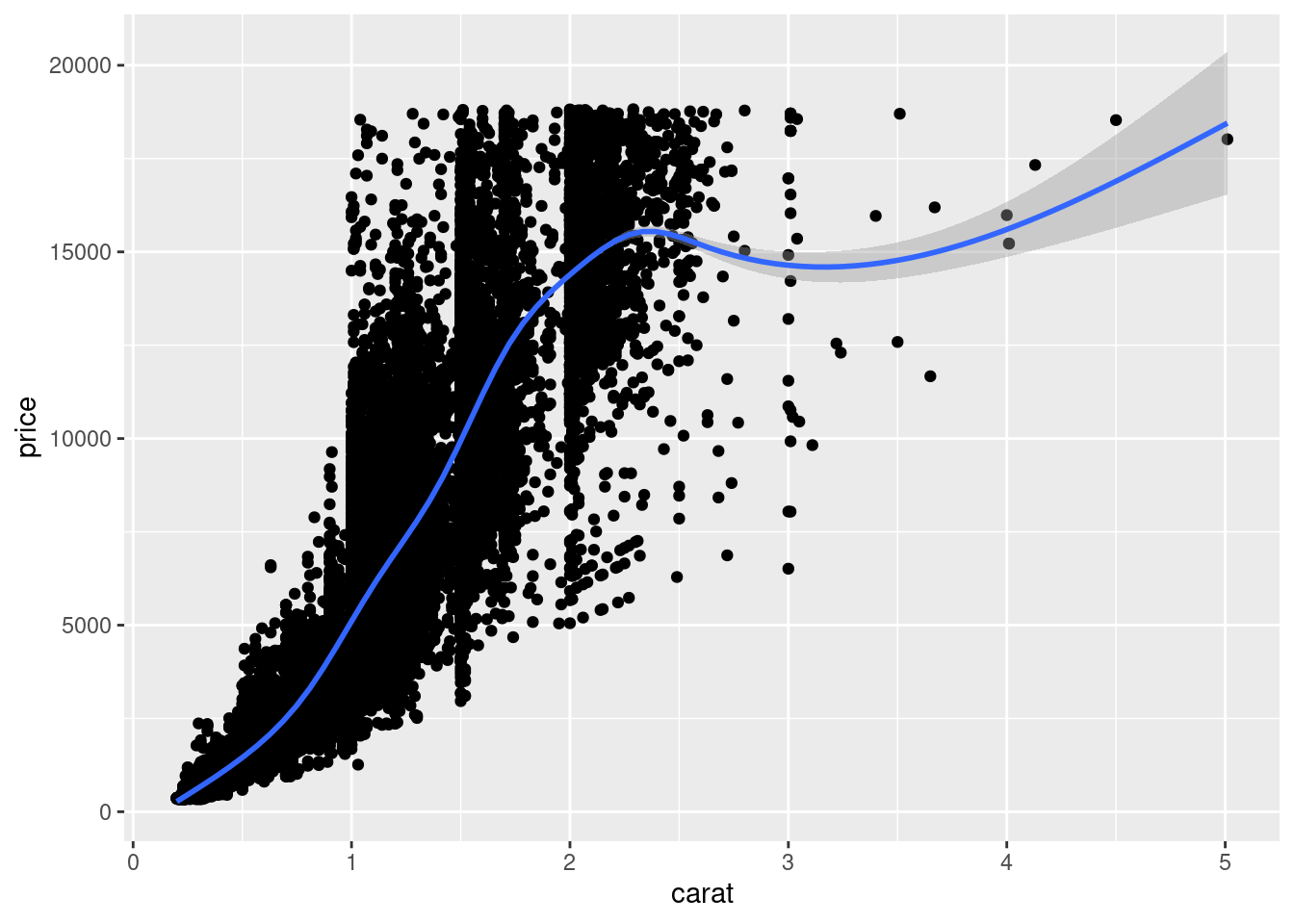
4.1.4 Changing One vs Many geoms
Some aesthetics will apply to both geometries that you use, these can be added in the (ggplot()) function. Color is one such example.
# Map the color aesthetic to clarity
ggplot(diamonds, aes(carat, price, color = clarity)) +
  geom_point() +
  geom_smooth()
## `geom_smooth()` using method = 'gam' and formula = 'y ~ s(x, bs = "cs")'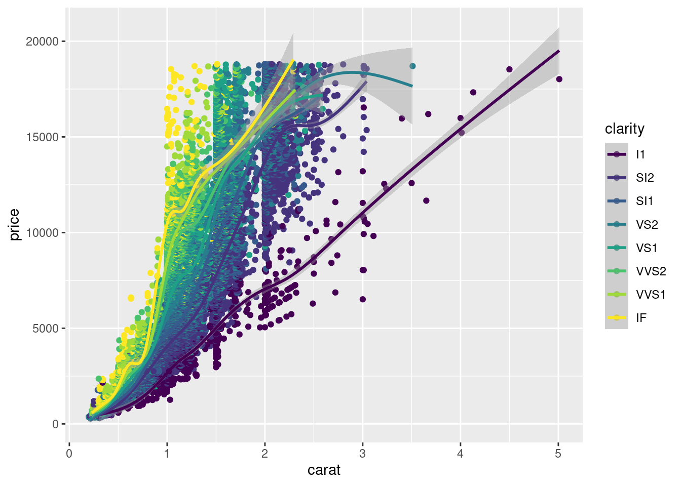
Some aesthetics will only work with one aesthetic. The alpha aesthetic will only work with (geom_point), not (geom_smooth). The alpha aesthetic changes the transparency of of the points.
# add the alpha aesthetic
ggplot(diamonds, aes(carat, price, color = clarity)) +
  geom_point(alpha = 0.4) +
  geom_smooth()
## `geom_smooth()` using method = 'gam' and formula = 'y ~ s(x, bs = "cs")'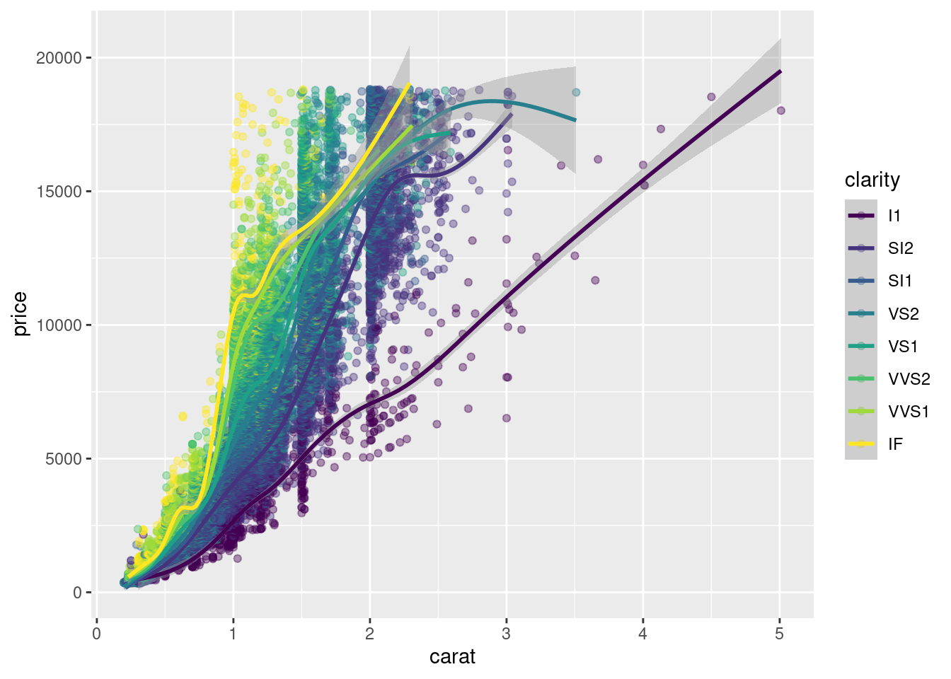
4.2 Aesthetics
Aesthetics determine the variables and information we put on the graph. The standard x and y aesthetic determine our axis, but we can use size, shape, color and others to put even more information on a graph.
4.2.1 Color, Shape and Size
We will start by creating our standard scatter plot below. This includes just the x and y aesthetics.
#create new data set with cyl as a categorical variable
mtcars <- mtcars %>% mutate(fcyl = factor(cyl))

# Map x to mpg and y to fcyl
ggplot(mtcars, aes(x = mpg, y = fcyl)) +
  geom_point()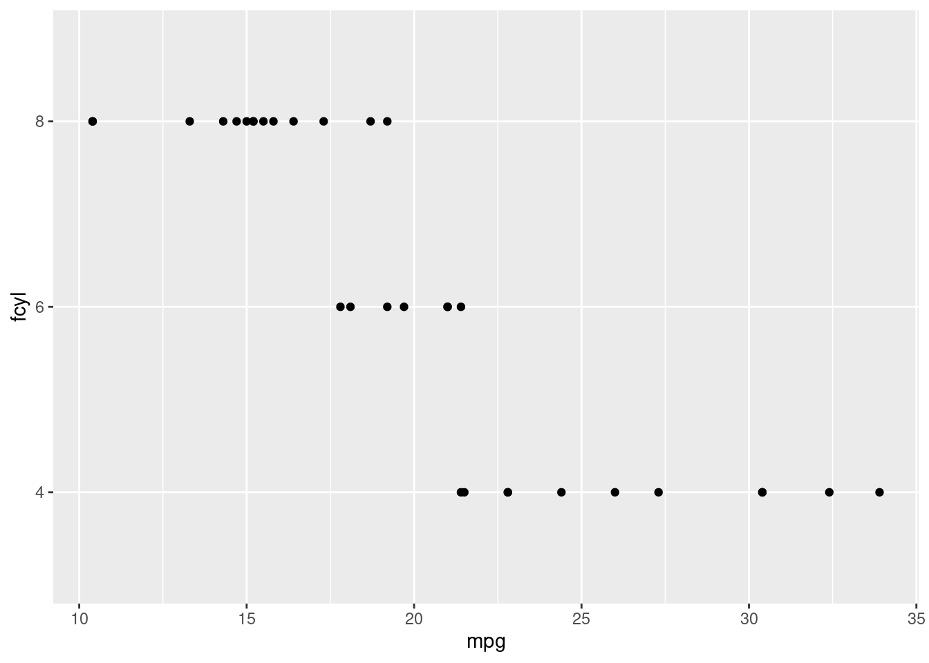
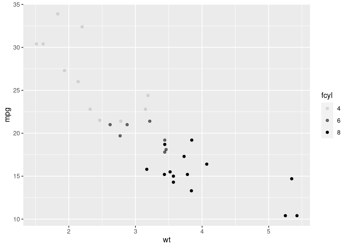
To add more information to our graph, we will use the color aesthetic. The color aesthetic will color the points in our scatter plot according to the variable given.
# Map x to wt, y to mpg and color to fcyl
ggplot(mtcars, aes(x = wt, y=mpg, color = fcyl)) +
  geom_point()
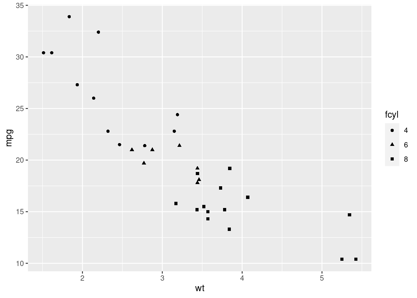
Next, we will use the shape and size aesthetics. The size aesthetic changes the size of the points, and the shape aesthetic changes the shape. We can use the shape and size aesthetics to convey information about a variable, but in the example below we will just use them to change how the graph looks.
ggplot(mtcars, aes(wt, mpg, color = fcyl)) +
# Set the shape and size of the points
geom_point(shape = 1, size = 4)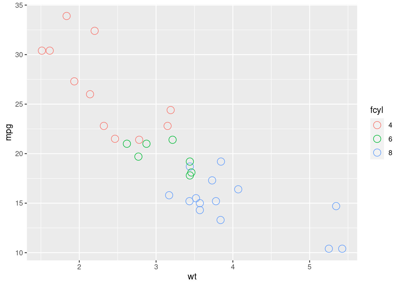 ### Color vs Fill
In most cases, color determines the outline and fill determines the inside. (geom_point()) is an exception to that with color determining the inside of the points. Some shapes are special, allowing you to use both fill to determine the inside and color to determine the outline
One of these shapes is 21. The default shape is 19.
#Use fill aesthetic with fcyl
ggplot(mtcars, aes(wt, mpg, fill = fcyl)) +
  # Change point shape to 21
  geom_point(shape = 21, size = 4)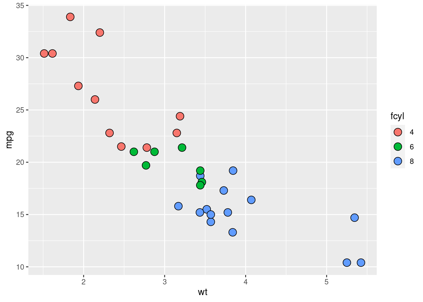
we can add the alpha aesthetic to change the tramsparency of the points
ggplot(mtcars, aes(wt, mpg, fill = fcyl)) +
  # Change point shape to 21; set alpha = .6
  geom_point(shape = 21, size = 4, alpha = 0.6)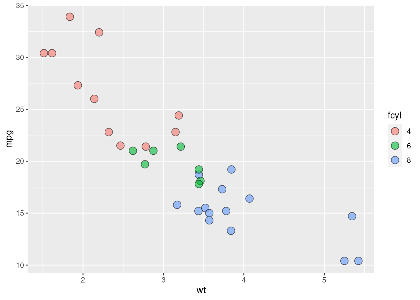
We can use color to add even more information to our graph, allowing us to show 4 variables on one scatterplot!
#create fam variable as a categorical variable
mtcars <- mtcars %>% mutate(fam = factor(am))

# Map color to fam
ggplot(mtcars, aes(wt, mpg, fill = fcyl, color = fam)) +
  geom_point(shape = 21, size = 4, alpha = 0.6)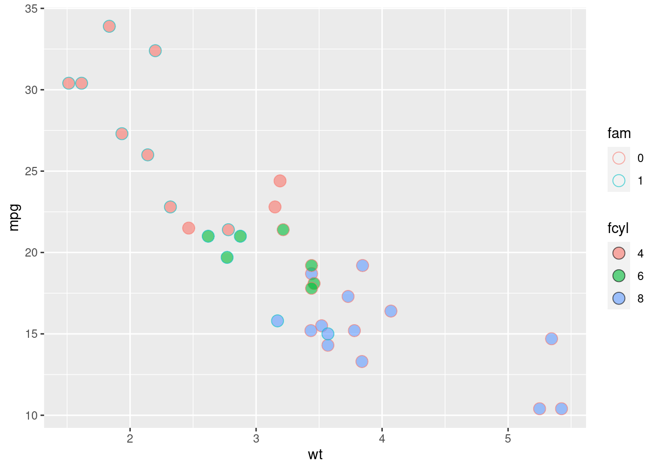
4.2.2 Comparing Aesthetics
In this section, we will see how different aesthetics change how the graph looks. They will all display the same information, but they will display it in different ways.
4.2.2.1 Size
# Establish the base layer
plt_mpg_vs_wt <- ggplot(mtcars, aes(x=wt, y=mpg))

# Map fcyl to size
plt_mpg_vs_wt +
  geom_point(aes(size=fcyl))
## Warning: Using size for a discrete variable is not advised.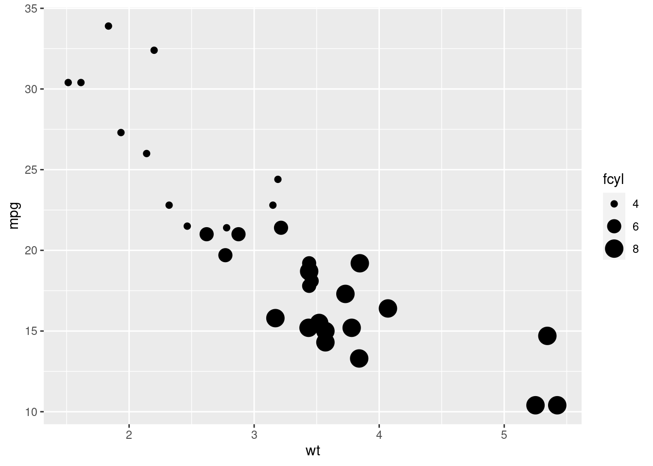
4.2.3 Attributes
Attributes change how the graph looks. They are the same functions as aesthetics, but attributes don’t tell us any new information about our data set. Aesthetics go inside the aes function in either the base layer or the geom layer. attributes will always go in the geom layer, outside the aes function.
In the first example we will use the color and alpha attributes. The color attribute will make all the points the color specified, and the alpha attribute will make the points as transpaerent as specified
ggplot(mtcars, aes(wt, mpg)) +
  # Set the point color and alpha
  geom_point(color="blue", alpha = 0.6)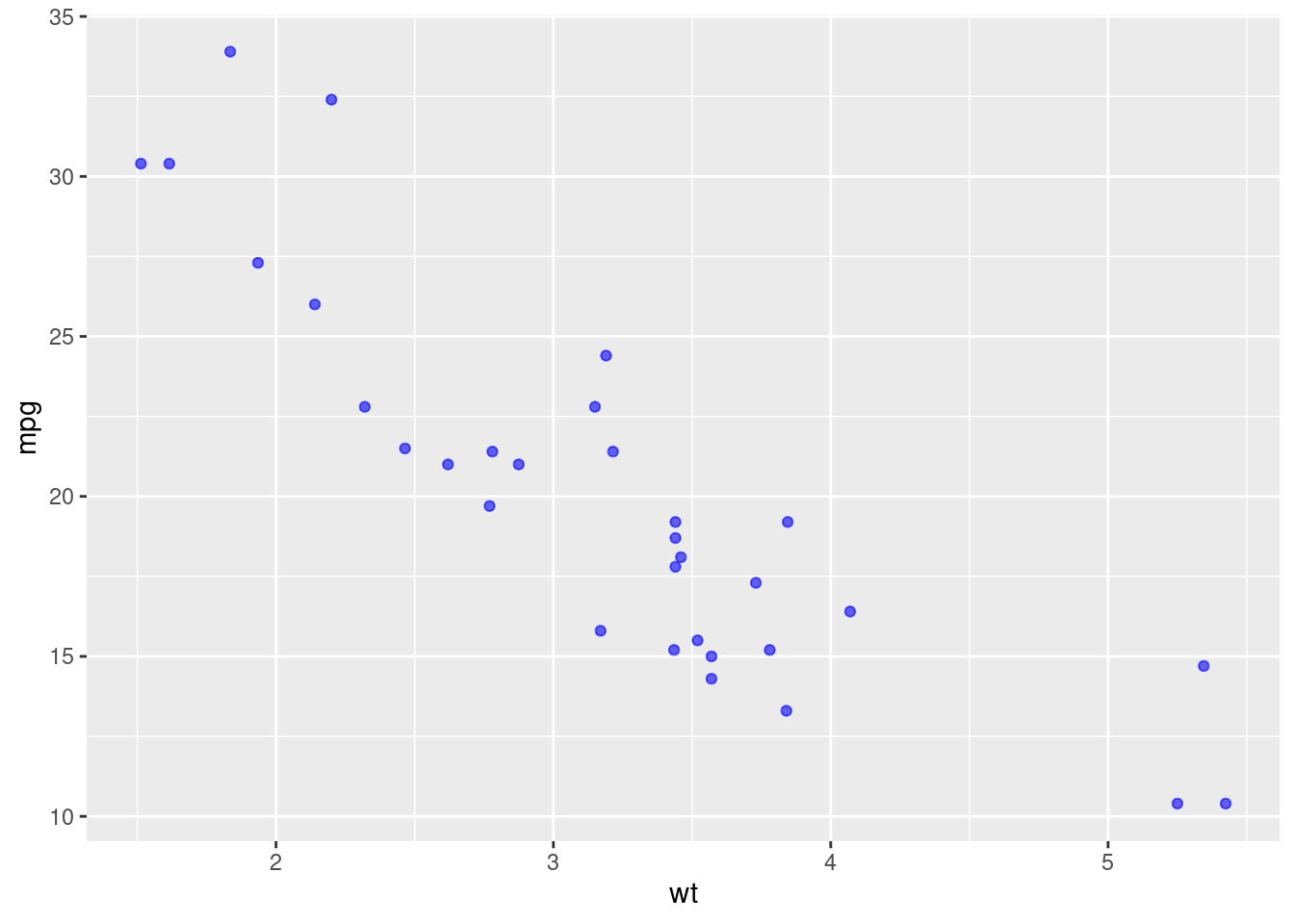
In the second example, we will add the size and shape attributes. The size attribute controls the size of all points, and the shape attribute sets all points as the shape that coeresponds with the number selected
# Change the color mapping to a fill mapping
ggplot(mtcars, aes(wt, mpg)) +
  # Set point size and shape
  geom_point(color="blue", size=10, shape=1)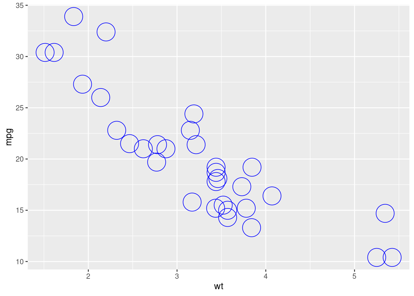
When attributes conflct with aesthetics, the attribute will be used to create the graph.
ggplot(mtcars, aes(wt, mpg, color = fcyl)) +
  # Add points layer with shape 24 and color yellow
   geom_point(shape=24, color = "yellow")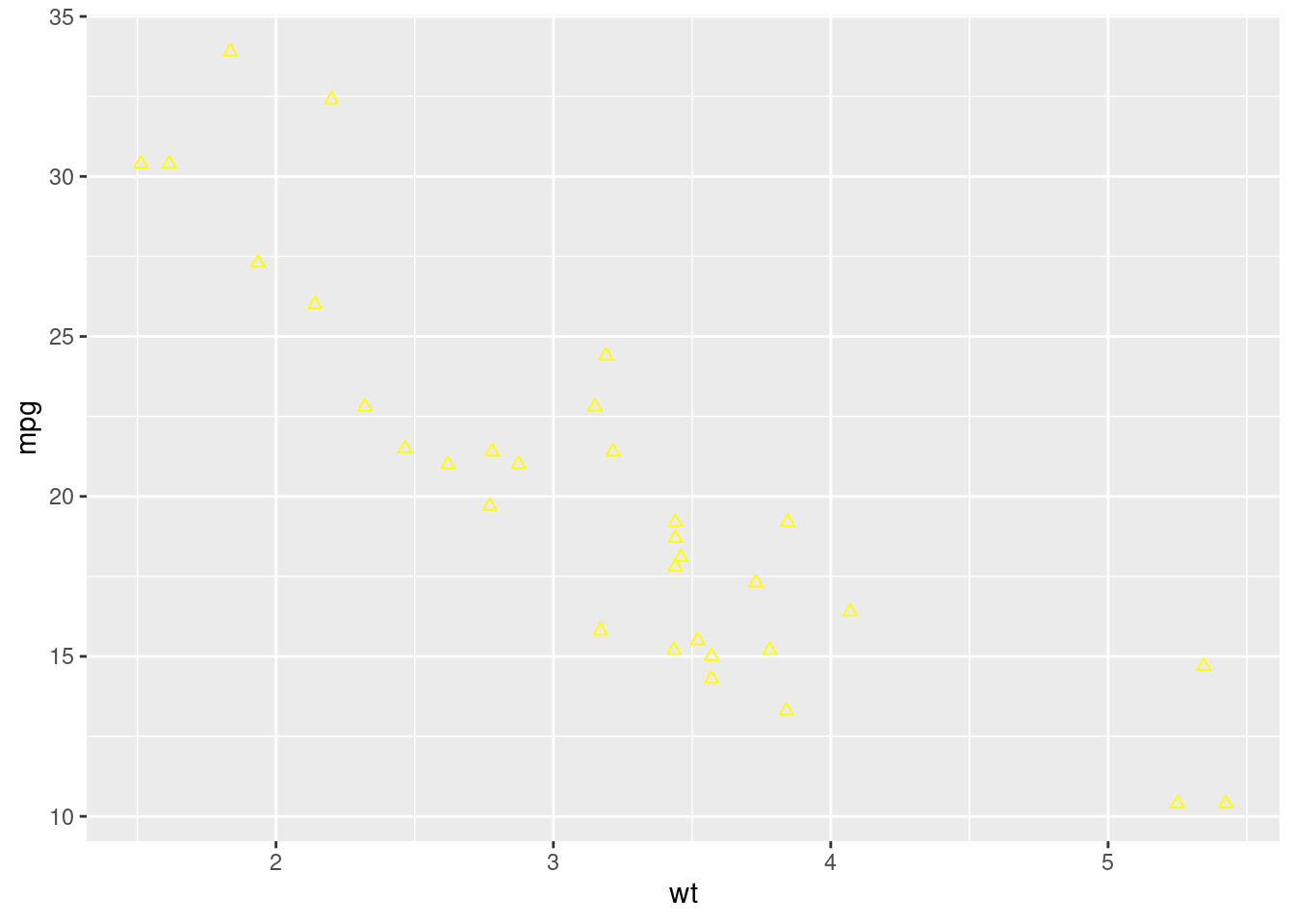
4.2.4 Using Aesthetic Labels
When our graphs are hard to read, or aren’t clear, we can modify the aesthetic to make it clear. One of the things we can do is add labels. to add a label, write (+ labs()) after the geom layer. to write an x axis label, use x=“label”. The same goes for the y axis and to add a title, just us y=“label” and title=“title”.
ggplot(mtcars, aes(fcyl, fill = fam)) +
  geom_bar() +
  # Set the axis labels
  labs(x="Number of Cylinders", y="Count")
We can change the colors by adding a costoum fill scale using the function scale_fill_manual
palette <- c(automatic = "#377EB8", manual = "#E41A1C")

# Set the position
ggplot(mtcars, aes(fcyl, fill = fam)) +
  geom_bar() +
  labs(x = "Number of Cylinders", y = "Count")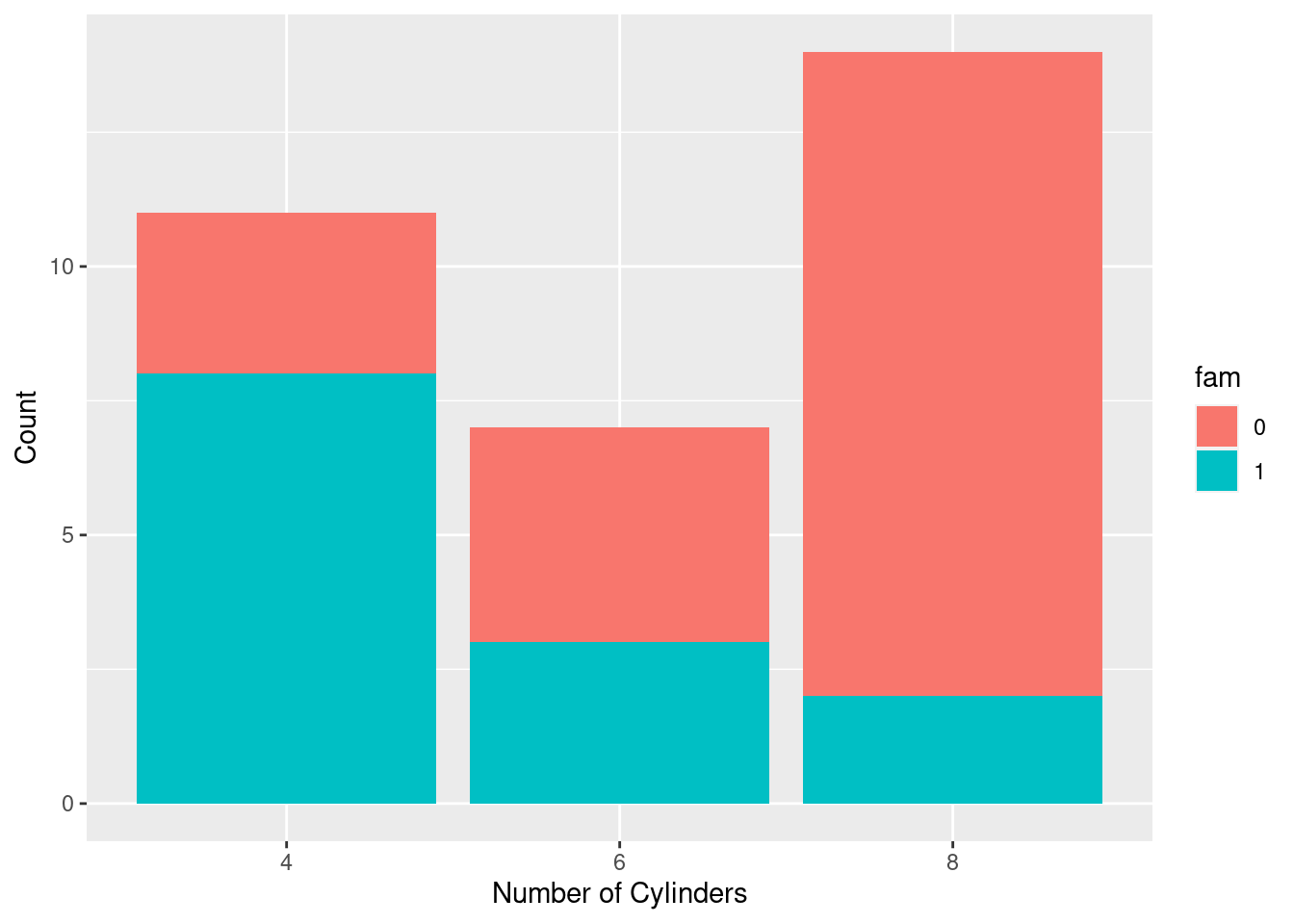
## <ggproto object: Class ScaleDiscrete, Scale, gg>
##     aesthetics: fill
##     axis_order: function
##     break_info: function
##     break_positions: function
##     breaks: waiver
##     call: call
##     clone: function
##     dimension: function
##     drop: TRUE
##     expand: waiver
##     get_breaks: function
##     get_breaks_minor: function
##     get_labels: function
##     get_limits: function
##     guide: legend
##     is_discrete: function
##     is_empty: function
##     labels: waiver
##     limits: function
##     make_sec_title: function
##     make_title: function
##     map: function
##     map_df: function
##     n.breaks.cache: NULL
##     na.translate: TRUE
##     na.value: grey50
##     name: Transmission
##     palette: function
##     palette.cache: NULL
##     position: left
##     range: environment
##     rescale: function
##     reset: function
##     scale_name: manual
##     train: function
##     train_df: function
##     transform: function
##     transform_df: function
##     super:  <ggproto object: Class ScaleDiscrete, Scale, gg>
We can make the transition types for ech cylinder count be side by side using position = 'dodge' inside the geom_bar() layer
# Set the position
ggplot(mtcars, aes(fcyl, fill = fam)) +
  geom_bar(position = 'dodge') +
  labs(x = "Number of Cylinders", y = "Count")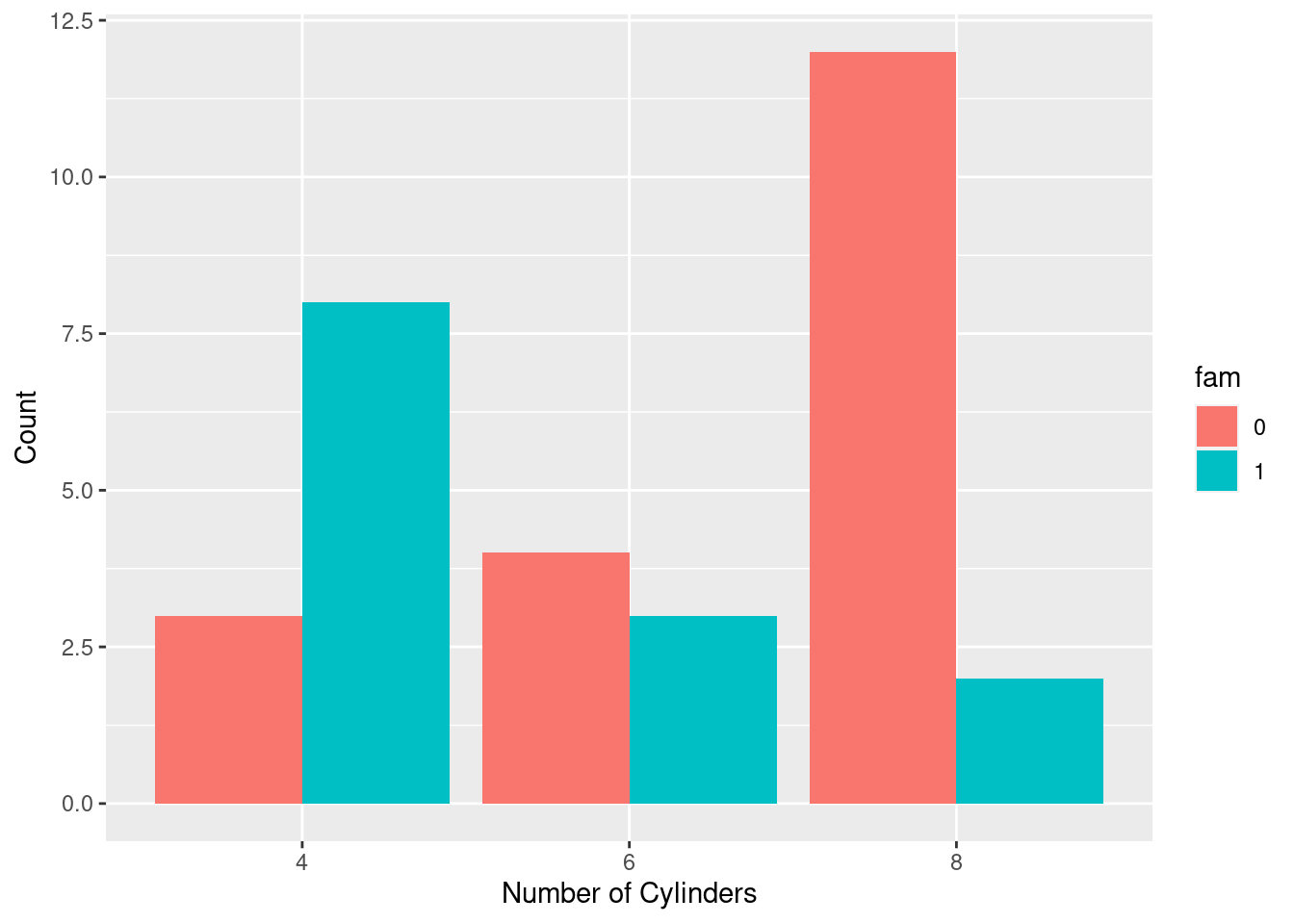
## <ggproto object: Class ScaleDiscrete, Scale, gg>
##     aesthetics: fill
##     axis_order: function
##     break_info: function
##     break_positions: function
##     breaks: waiver
##     call: call
##     clone: function
##     dimension: function
##     drop: TRUE
##     expand: waiver
##     get_breaks: function
##     get_breaks_minor: function
##     get_labels: function
##     get_limits: function
##     guide: legend
##     is_discrete: function
##     is_empty: function
##     labels: waiver
##     limits: function
##     make_sec_title: function
##     make_title: function
##     map: function
##     map_df: function
##     n.breaks.cache: NULL
##     na.translate: TRUE
##     na.value: grey50
##     name: Transmission
##     palette: function
##     palette.cache: NULL
##     position: left
##     range: environment
##     rescale: function
##     reset: function
##     scale_name: manual
##     train: function
##     train_df: function
##     transform: function
##     transform_df: function
##     super:  <ggproto object: Class ScaleDiscrete, Scale, gg>
4.2.5 Setting Scales
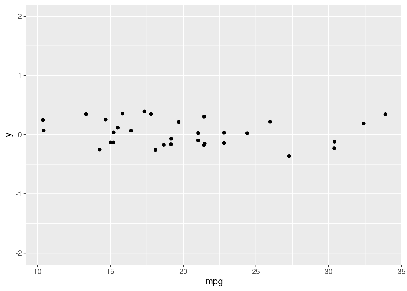
The x and y axis will always be provided when using geom_point() even if you set x or y equal to 0. To set axis limits you can use + ylim(lo, hi) after the geom layer. this works for the x axis as well.
4.2.6 Aesthetic Best Practices
When creating graphs it is important to remember that the primary goal is to inform the viewer by conveying information, and our secondary goal is to create visually appealing graphs. Certain aesthetics work well with categorical variables, and others work well with numerical variables. Adding too much information may be confusing, but so may be adding too little. The skill is to know what to add, and how much of it to add to create informative and appealing graphs.
4.3 Geometries
This section will cover the geometry layer. This determines how the plot actually looks. The geometries are accessed by their own geom. Each geom has their own required aesthetics and their own optional aesthetics.
4.3.1 Overploting
Often, graphs suffer from over crowding. This can occur for a number of reasons, and how we address it will change with the reason.
4.3.1.1 Large Data Sets
When we have large data sets, we can adjust the point transparency to show were we have clusters of data points, and we can change the size of the points themselves. Using shape = "." will create points the size of one pixel
# Plot price vs. carat, colored by clarity
plt_price_vs_carat_by_clarity <- ggplot(diamonds, aes(carat, price, color = clarity))

# Add a point layer with tiny points
plt_price_vs_carat_by_clarity + geom_point(alpha=.5, shape=".")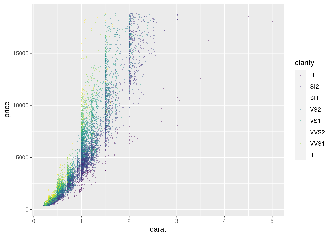
If the points are too small, we can try a different shaped point.
# Plot price vs. carat, colored by clarity
plt_price_vs_carat_by_clarity <- ggplot(diamonds, aes(carat, price, color = clarity))
# Set transparency to 0.5 and shape to 16
plt_price_vs_carat_by_clarity + geom_point(alpha = 0.5, shape = 16)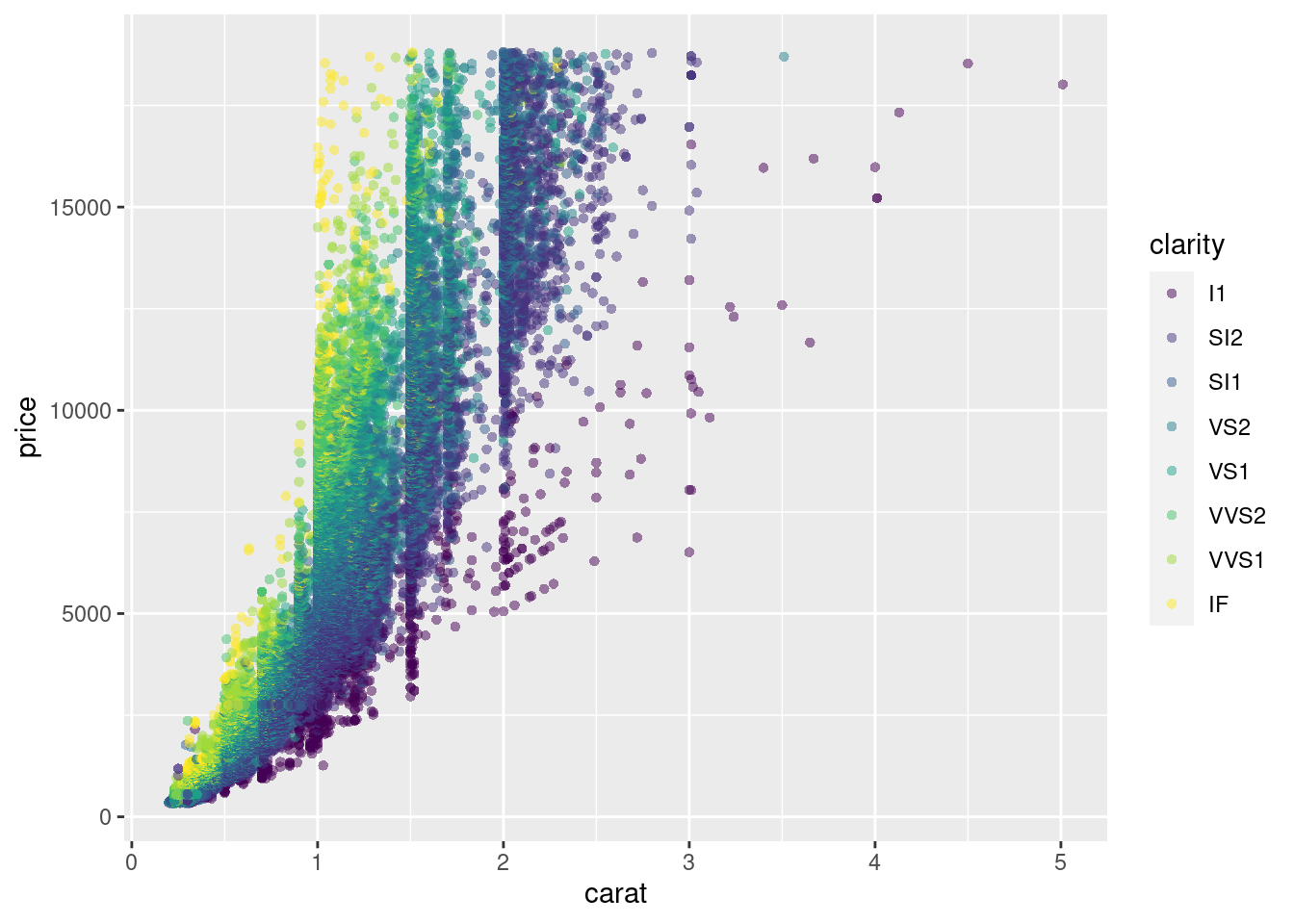 #### Aligned Values
When we have aligning values on a single axis, we can use jittering to make the graph more readable. We will start with a scatterplot, and use the position_jitter function inside the geom layer.
# Plot base
plt_mpg_vs_fcyl_by_fam <- ggplot(mtcars, aes(fcyl, mpg, color = fam))

# Default points are shown for comparison
plt_mpg_vs_fcyl_by_fam + geom_point()
# Alter the point positions by jittering, width 0.3
plt_mpg_vs_fcyl_by_fam + geom_point(position=position_jitter(width= 0.3))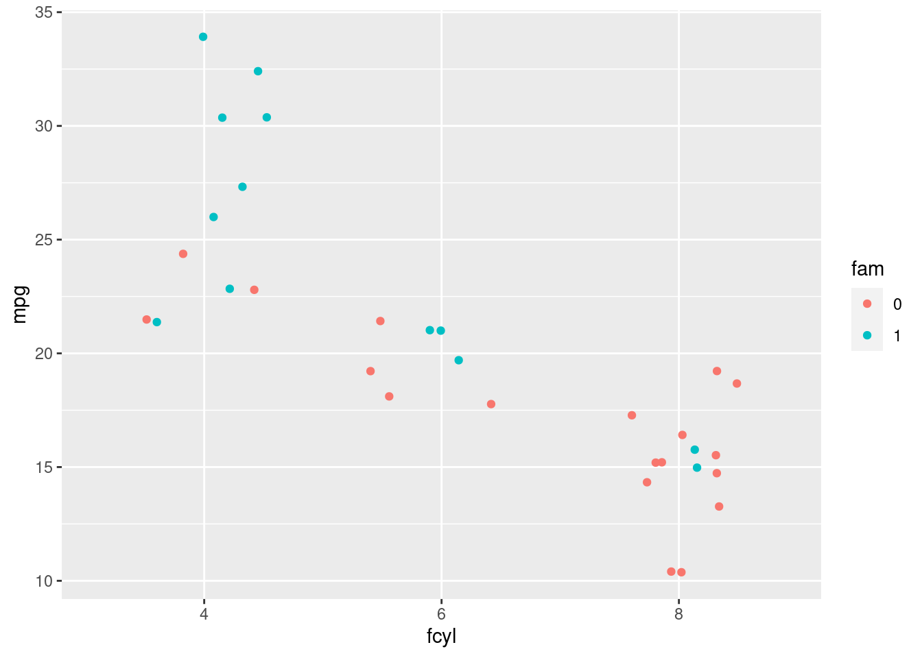
we could also use the position_jitterdodge function to do the same thing.
# Plot base
plt_mpg_vs_fcyl_by_fam <- ggplot(mtcars, aes(fcyl, mpg, color = fam))

# Default points are shown for comparison
plt_mpg_vs_fcyl_by_fam + geom_point()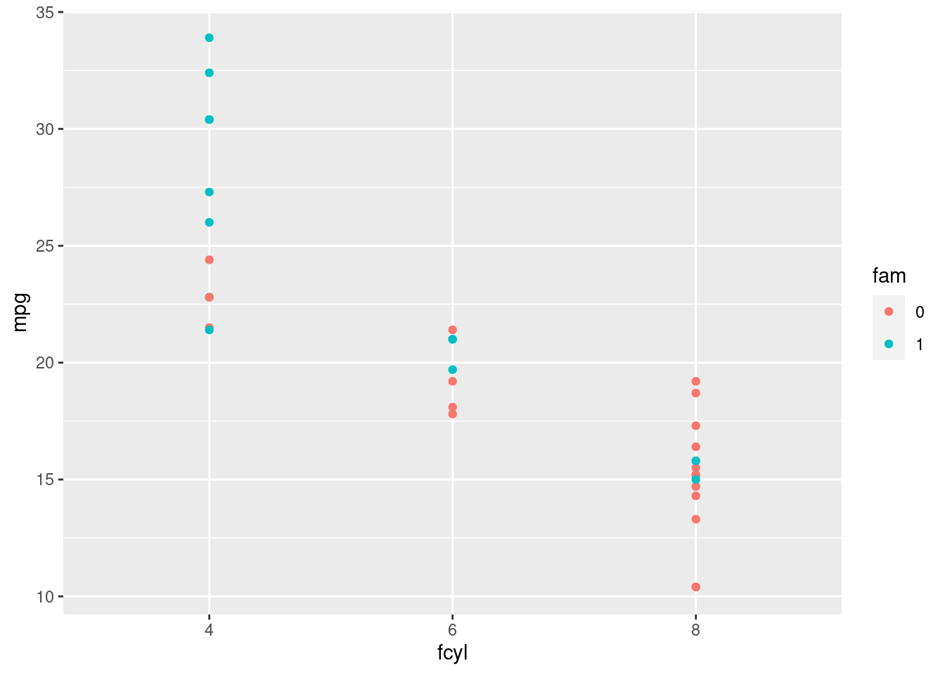
# Now jitter and dodge the point positions
plt_mpg_vs_fcyl_by_fam + geom_point(position = position_jitterdodge(jitter.width = 0.3, dodge.width = 0.3))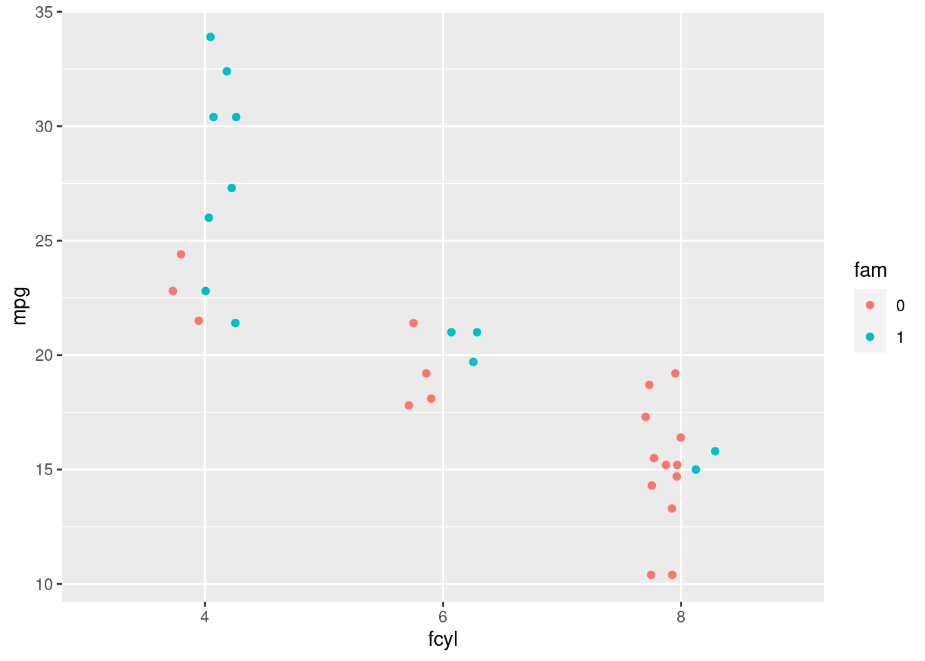
4.3.1.2 Low-percision Data
When we have low-resolution measurements, like the ones in the iris data set, which is measured to 1mm, we may want to jitter both the x and y axis. One way we can do this is with geom_jitter.
ggplot(iris, aes(Sepal.Length, Sepal.Width, color = Species)) +
  # Jitter layer with width 0.1
  geom_jitter(alpha = 0.5, width = 0.1)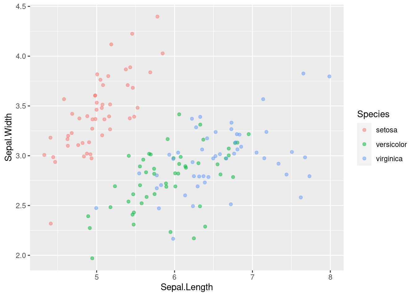
We can use geom_point with position="jitter".
ggplot(iris, aes(Sepal.Length, Sepal.Width, color = Species)) +
  # Set the position to jitter
  geom_point(alpha = 0.5, position="jitter")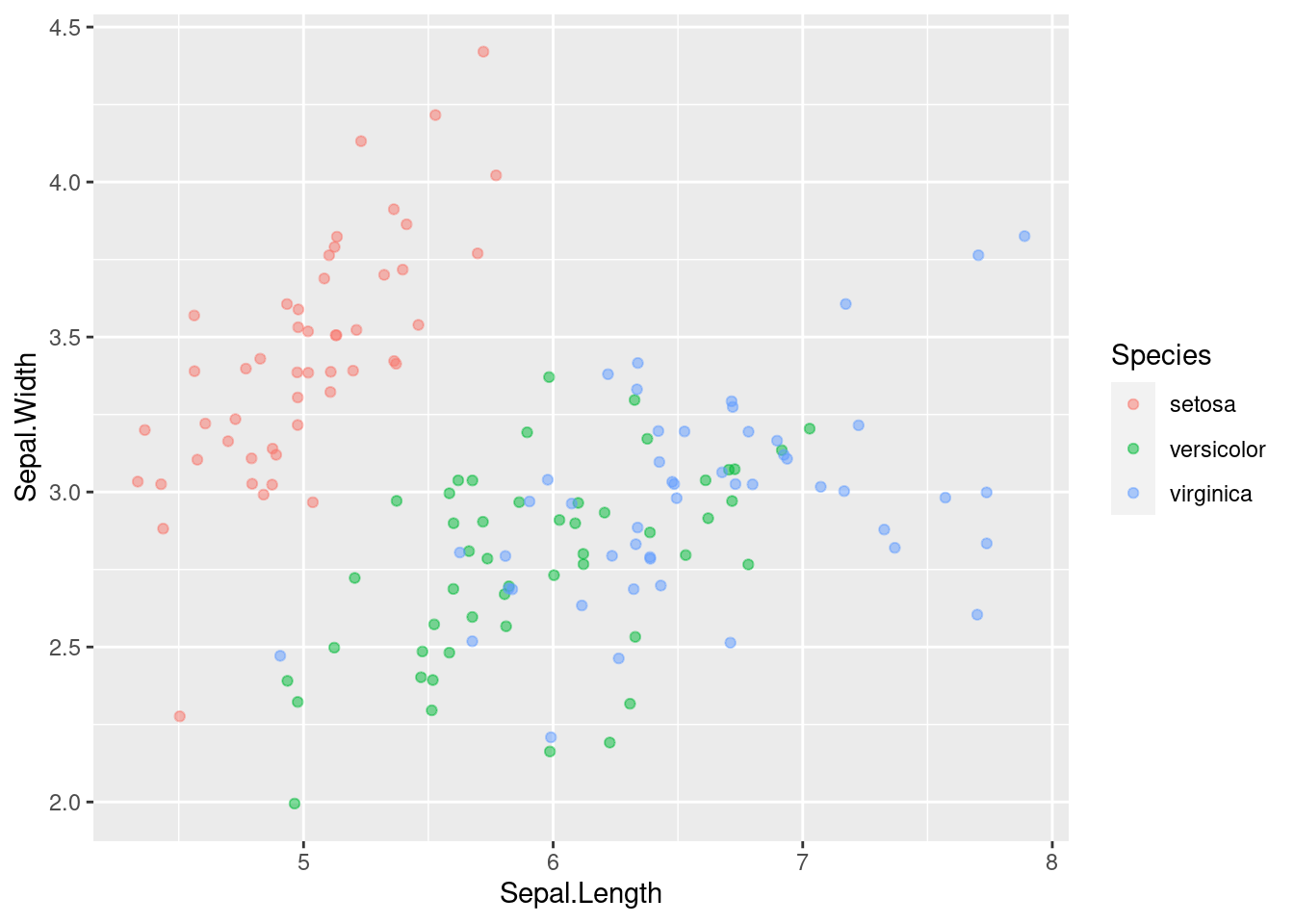
We can also use position = position_jitter(width=0.1) to get the same effect.
ggplot(iris, aes(Sepal.Length, Sepal.Width, color = Species)) +
  # Use a jitter position function with width 0.1
  geom_point(alpha = 0.5, position = position_jitter(width=0.1))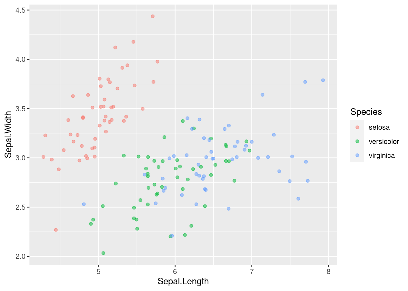
4.3.1.3 Integer Data
This can be type integer (i.e. 1 ,2, 3…) or categorical (i.e. class factor) variables. factor is just a special class of type integer. You’ll typically have a small, defined number of intersections between two variables, which is similar to case 3, but you may miss it if you don’t realize that integer and factor data are the same as low precision data.
We will start by plotting our typical scatterplot.
# Plot vocabulary vs. education
ggplot(Vocab, aes(x=education, y=vocabulary)) +
  # Add a point layer
  geom_point()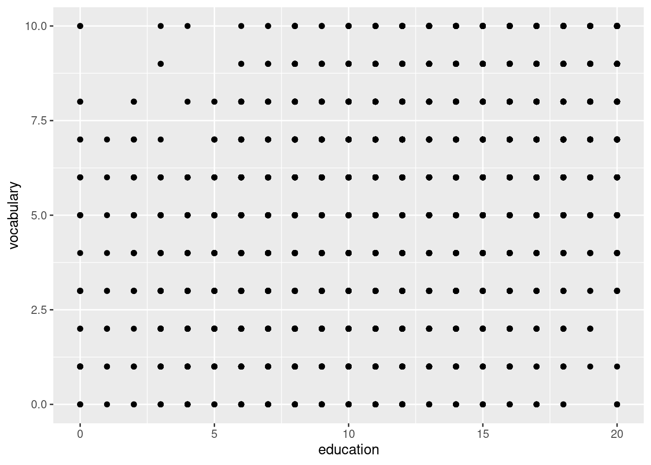
This is difficult to read and understand. We can use the jitter geometry to show us where the most points are, and with the help of alpha and shape, we can get a much better picture of what is happening than if we didn’t.
ggplot(Vocab, aes(education, vocabulary)) +
  # Set the shape to 1
  geom_jitter(alpha = 0.2, shape = 1)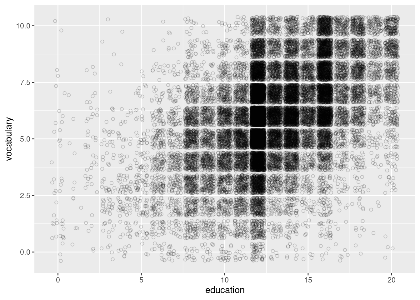
4.3.2 Histograms
Histograms are a type of plot that show the dinned distribution of a continuous variable. For a histogram, we only need one aesthetic, x, though there are others we can use.
4.3.2.1 Drawing Histograms
To draw a histogram, use geom_histogram() in the geometry layer.
## `stat_bin()` using `bins = 30`. Pick better value with `binwidth`.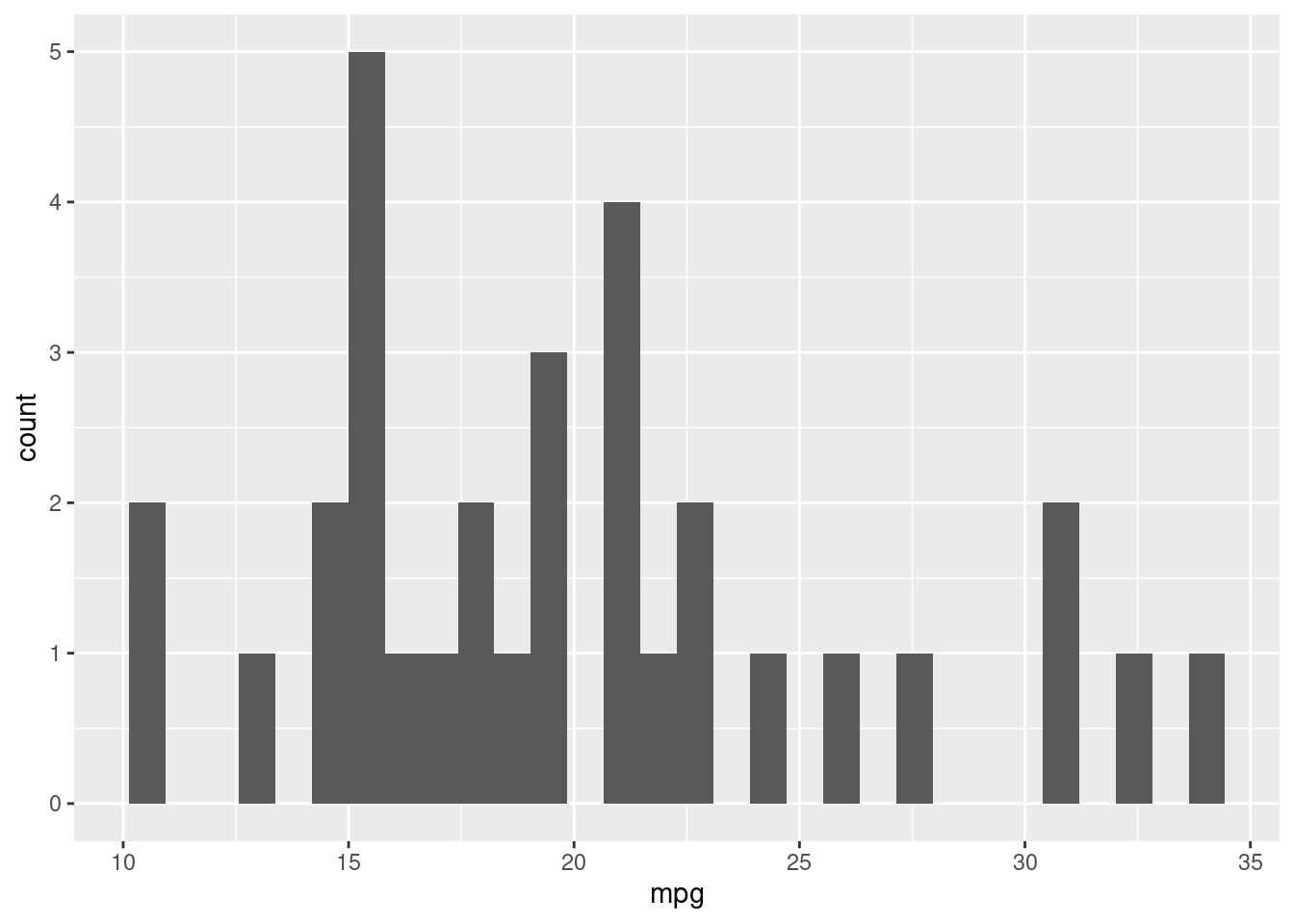
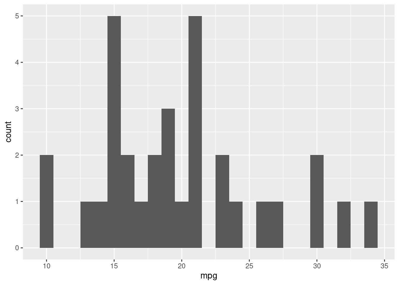
To change how wide the bins appear, we can use binwidth = 1 inside the geom. We can use other numbers to get different width bins.
If we map ..density.. to the y aesthetic, we will see the frequency densities rather than count.
## Warning: The dot-dot notation (`..density..`) was deprecated in ggplot2 3.4.0.
## ℹ Please use `after_stat(density)` instead.
## This warning is displayed once every 8 hours.
## Call `lifecycle::last_lifecycle_warnings()` to see where this warning was
## generated.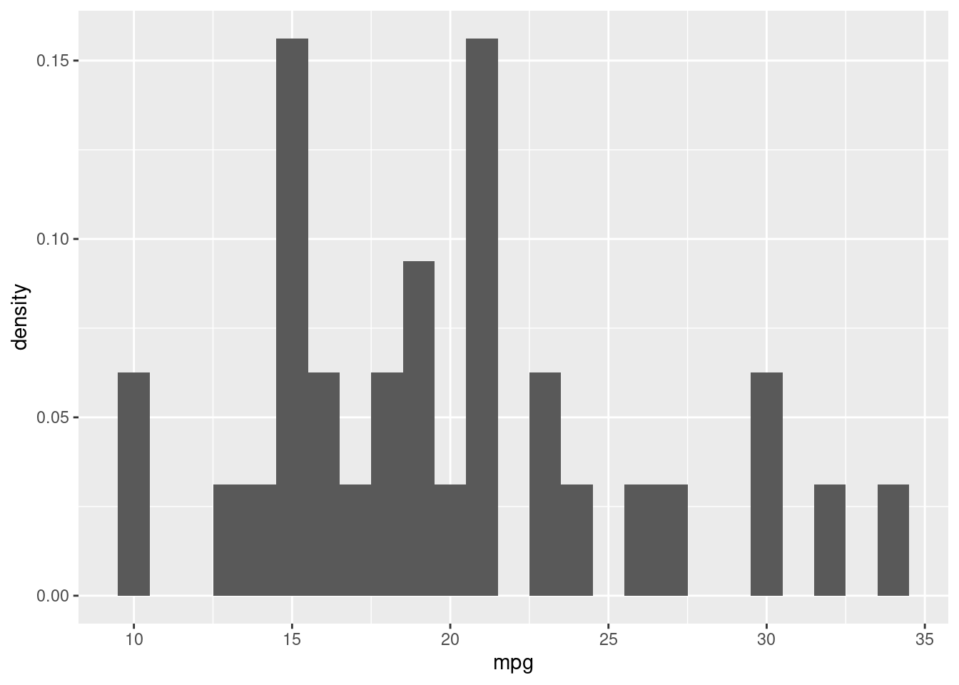
To change the color of the bars, we use the fill attribute in the geom layer.
datacamp_light_blue <- "#51A8C9"

ggplot(mtcars, aes(mpg, ..density..)) +
  # Set the fill color to datacamp_light_blue
  geom_histogram(binwidth = 1, fill = "blue")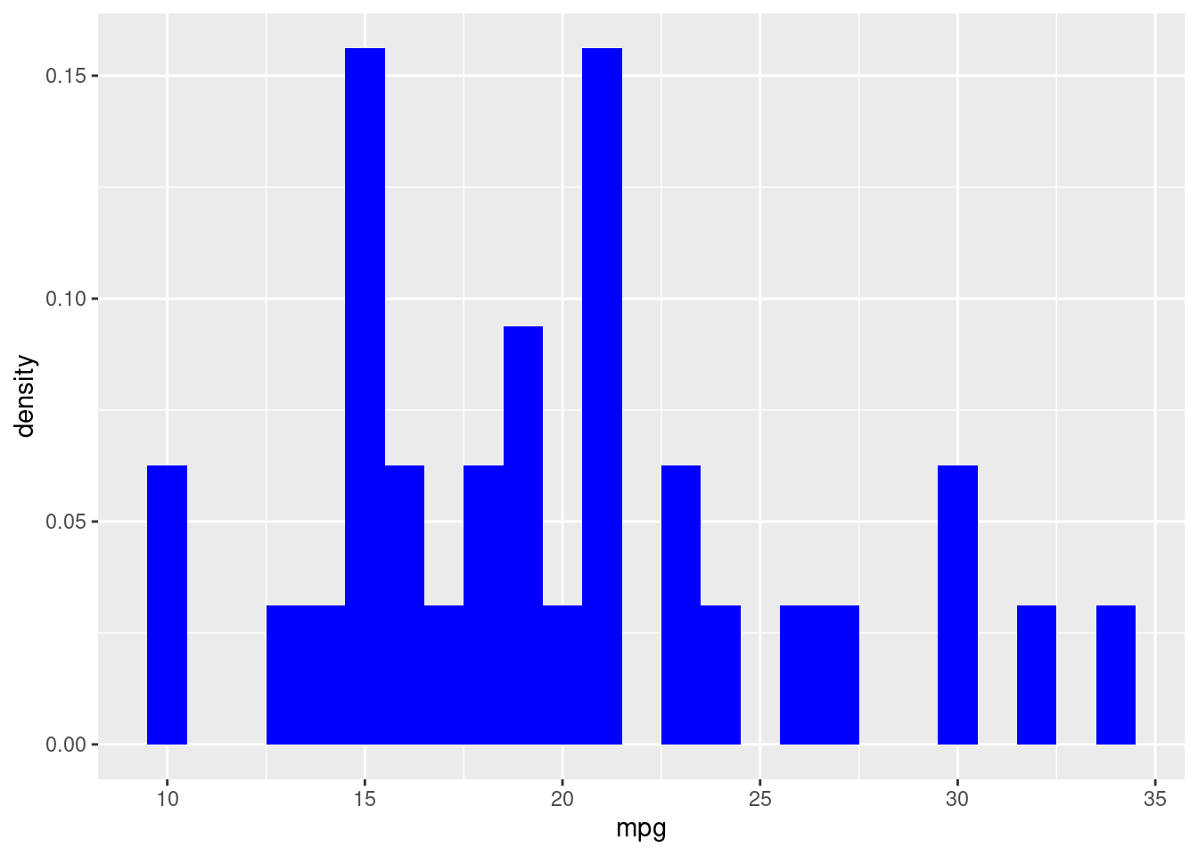
4.3.2.2 Positions in Histograms
Here, we’ll examine the various ways of applying positions to histograms. geom_histogram(), has a position argument that can take on the following values:
stack (the default): Bars for different groups are stacked on top of each other.
dodge: Bars for different groups are placed side by side.
fill: Bars for different groups are shown as proportions.
identity: Plot the values as they appear in the dataset.
ggplot(mtcars, aes(mpg, fill = fam)) +
  # Change the position to dodge
  geom_histogram(binwidth = 1, position = "dodge")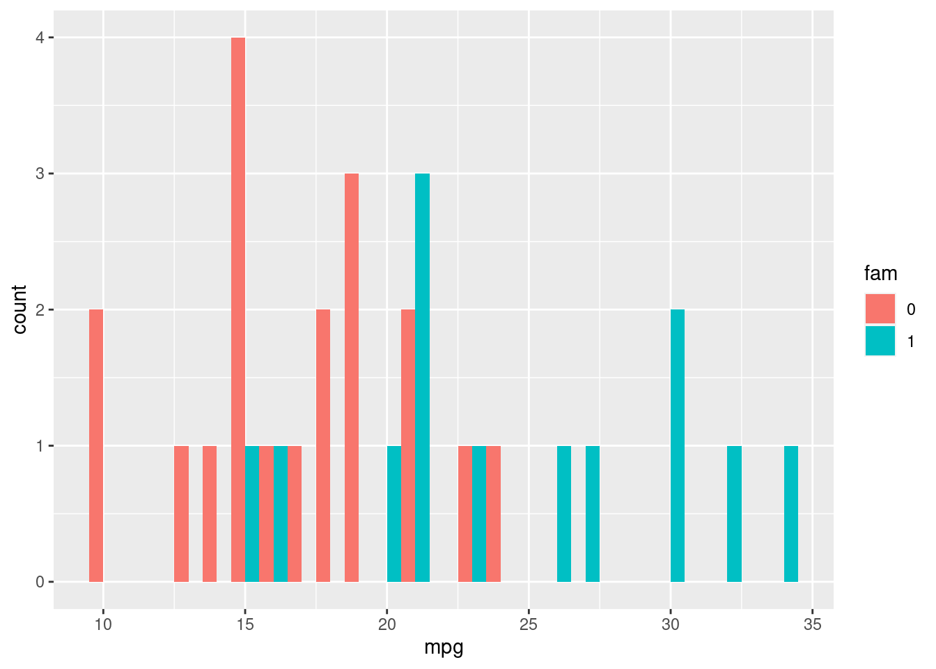
4.3.3 Bar Plots
Histograms are a specialized version of bar plots, where we have binned a continuous X-axis. Classic bar plots refer to a categorical X-axis. Here we need to use either geom_bar or geom_col. geom_bar will count the number of cases in each category of the variable mapped to the x-axis, whereas geom_col will just plot the actual value it finds in the data set.
4.3.3.1 Position in bar and col plots
We have three position options:
stack: The default
dodge: Preferred
fill: To show proportions
To use either the position or fill positions, in the geom layer, write position="dodge" or position="fill"
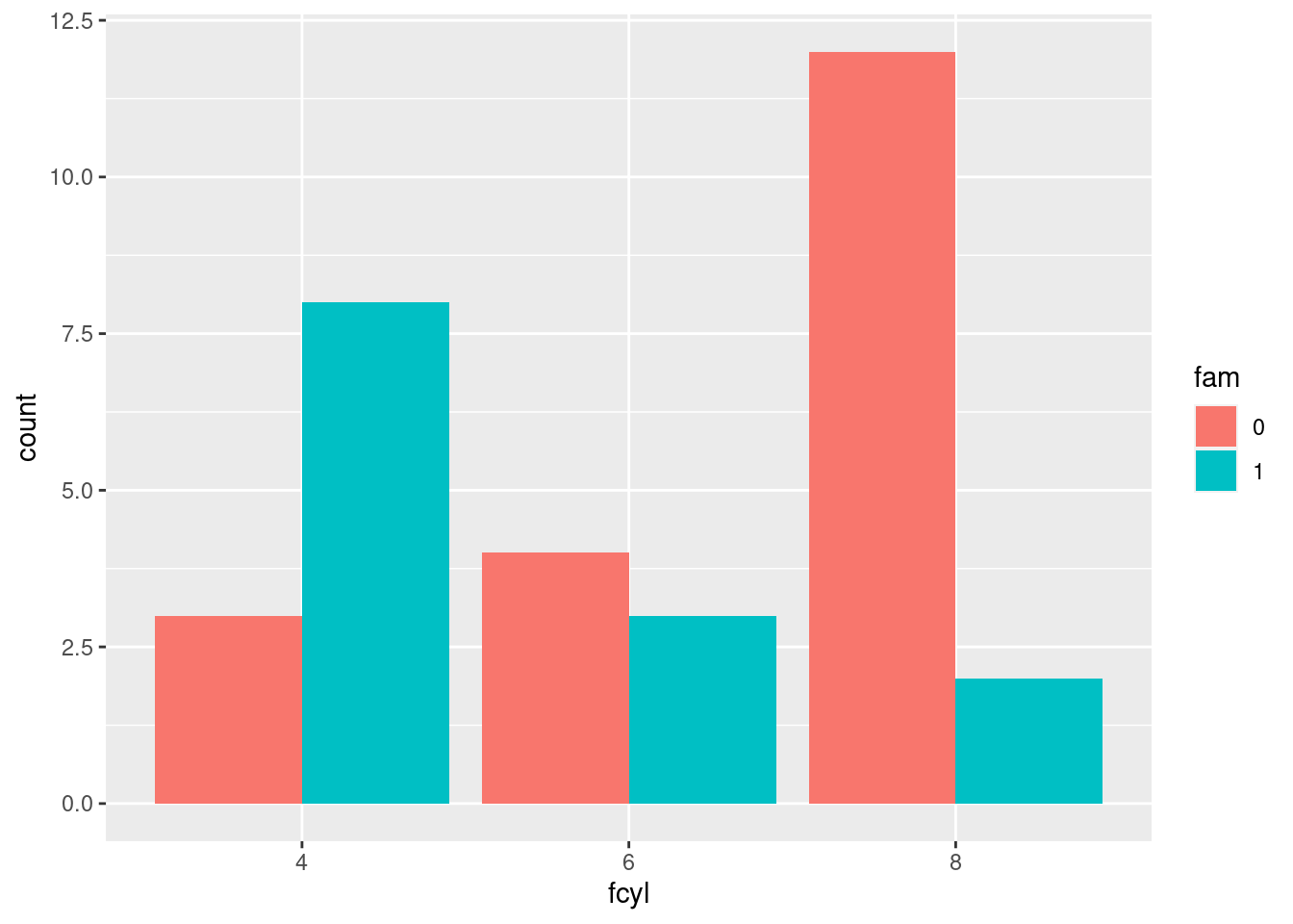
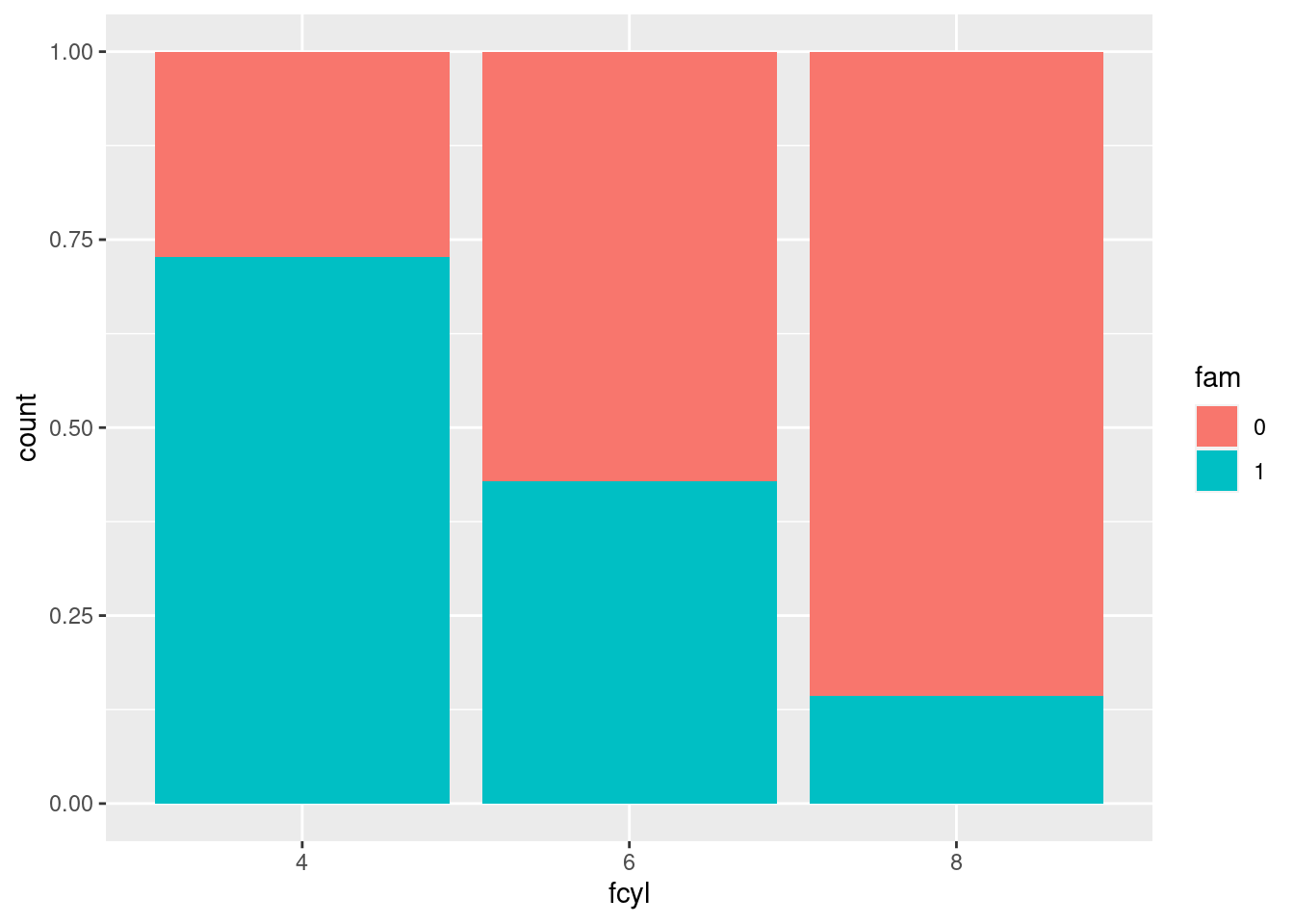
4.3.3.2 Overlaping bar plots
You can customize bar plots further by adjusting the dodging so that your bars partially overlap each other. Instead of using position = "dodge", you’re going to use position_dodge(), like with position_jitter(). Remember, the reason you want to use position_dodge()is to specify how much dodging you want.
ggplot(mtcars, aes(cyl, fill = fam)) +
  # Set the transparency to 0.6, # Change position to use the functional form, with width 0.2
  geom_bar(position = position_dodge(width = 0.2), alpha =0.6)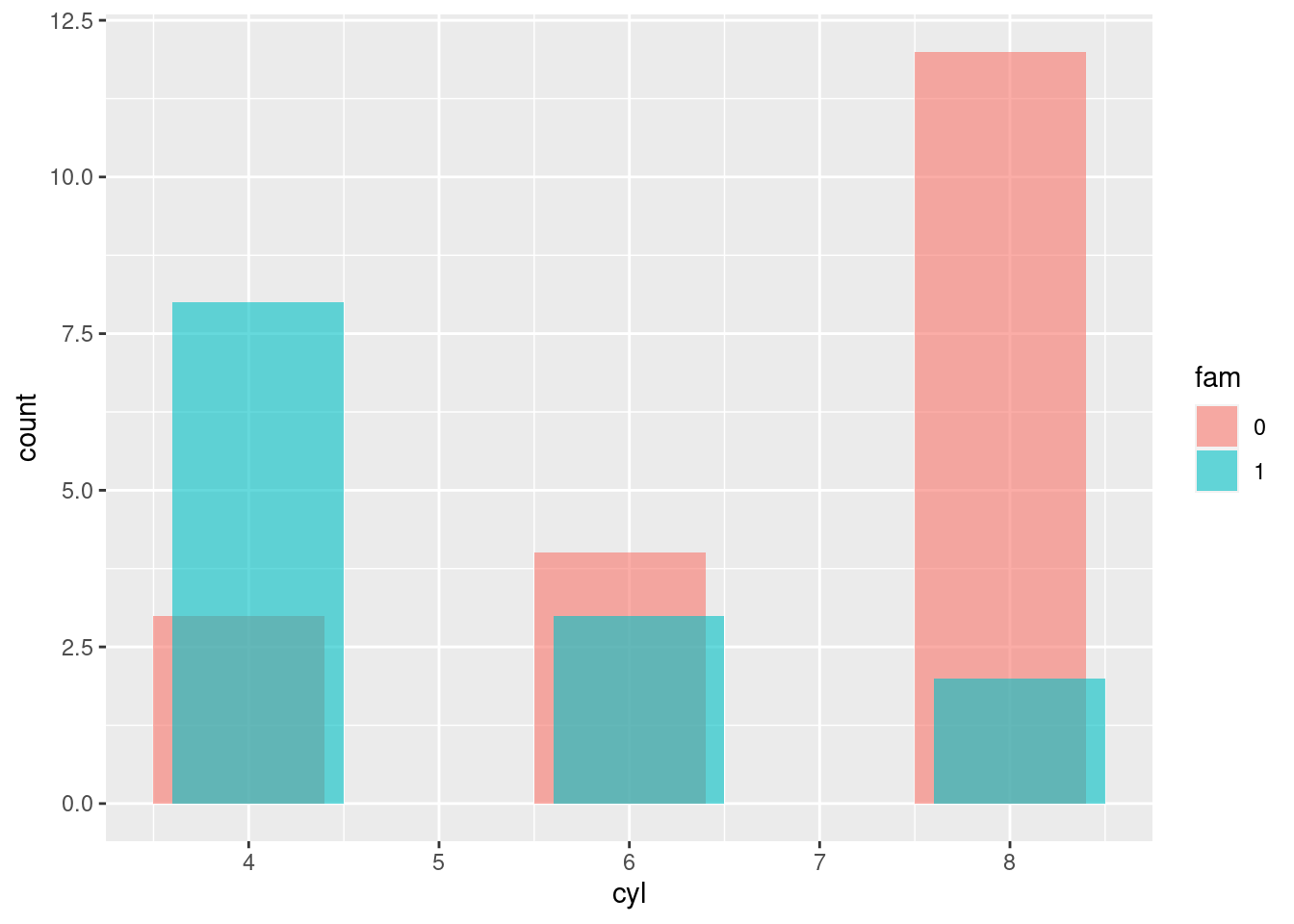
4.3.3.3 Bar plots: sequential color palette
In this bar plot, we’ll fill each segment according to an ordinal variable. The best way to do that is with a sequential color palette.
#make education and vocabulary categorical variables
Vocab <- Vocab %>% mutate(education = factor(education))
Vocab <- Vocab %>% mutate(vocabulary = factor(vocabulary))

# Plot education, filled by vocabulary
ggplot(Vocab, aes(education, fill = vocabulary)) +
  # Add a bar layer with position "fill"
  geom_bar(position = "fill") +
  # Add a brewer fill scale with default pallet
    scale_fill_brewer(palette = "Set1")
## Warning in RColorBrewer::brewer.pal(n, pal): n too large, allowed maximum for palette Set1 is 9
## Returning the palette you asked for with that many colors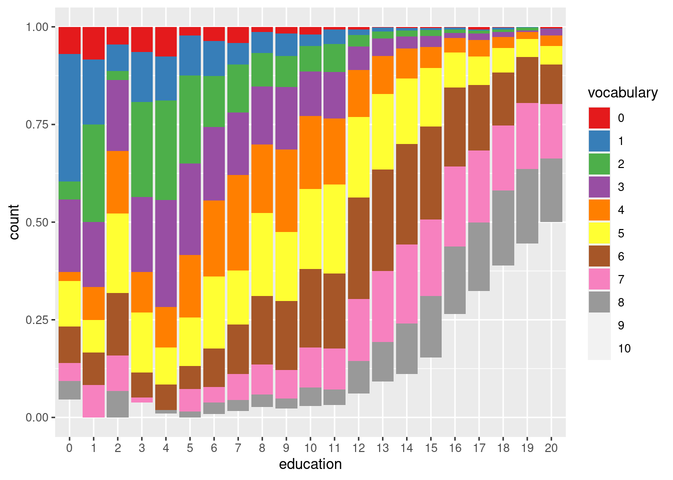
4.3.4 Line Plots
Line plots are another very common plot type.Line plots are very well suited to work is situations where a variable is time.
4.3.4.1 Basic line plots
To begin with, you can look at how the median unemployment time and the unemployment rate (the number of unemployed people as a proportion of the population) change over time.
# Using economics, plot unemploy vs. date
ggplot(economics, aes( x= date, y=unemploy)) +
  # Make it a line plot
  geom_line()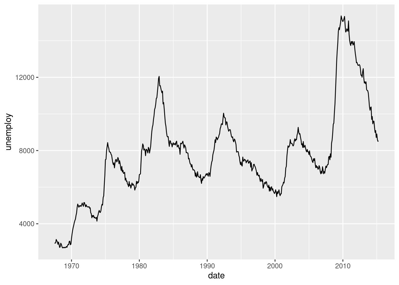
Adjust the y-axis aesthetic of the plot so that it represents the proportion of the population that is unemployed.
# Change the y-axis to the proportion of the population that is unemployed
ggplot(economics, aes(date, unemploy/pop)) +
  geom_line()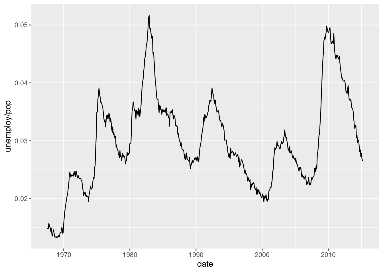
4.3.4.2 Multiple time series
We already saw how the form of your data affects how you can plot it. Let’s explore that further with multiple time series. Here, it’s important that all lines are on the same scale, and if possible, on the same plot.
Plot only the Rainbow salmon time series with geom_line().
# Plot the Rainbow Salmon time series
ggplot(fish.species, aes(x = Year, y = Rainbow)) +
  geom_line()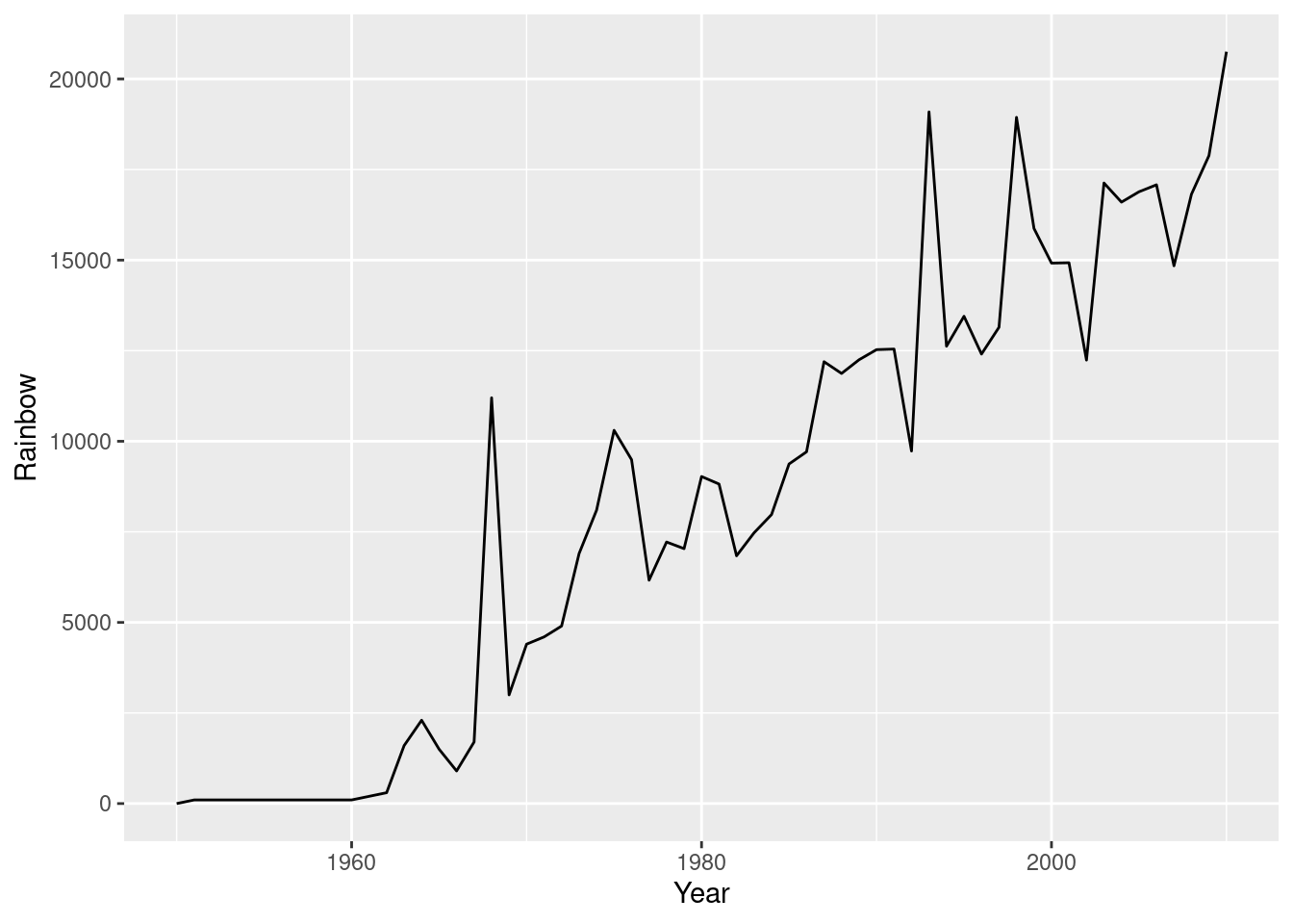
Plot only the Pink salmon time series with geom_line().
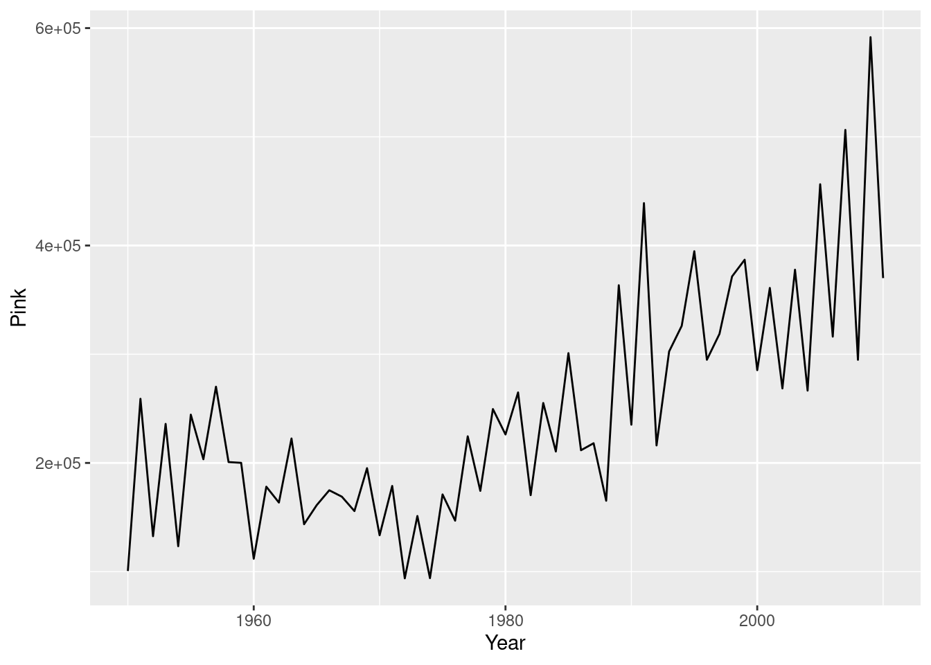
Now try and plot all time series in a single plot. Plot the fish.tidy dataset, mapping Year to x and Capture to y. Group by fish species within the aesthetics of geom_line().
# Plot multiple time-series by grouping by species
ggplot(fish.tidy, aes(x= Year, y = Capture)) +
  geom_line(aes(group = Species))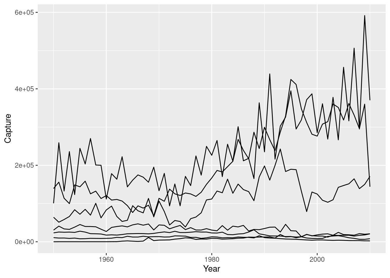
Let’s add color to the previous plot to distinguish between the different time series. Plot the fish.tidy dataset again, this time making sure to color by Species.
# Plot multiple time-series by coloring by species
ggplot(fish.tidy, aes(Year, Capture, color = Species)) +
  geom_line()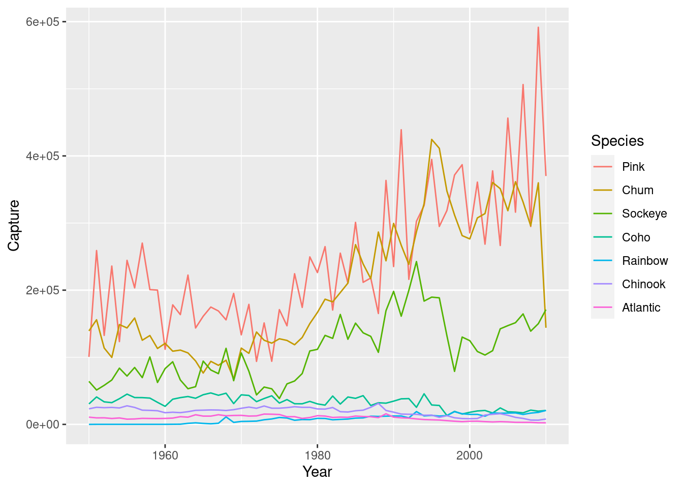
4.4 Themes
In this chapter DC gives you a few graphs as base plots that we need to recreate here to include those parts later. This is the code to replicate them (pretty close at least). We also need to create a dataset from gapminder for the final graph
## Graph we need to create to use in DC exercises
recess <- data.frame(
  begin = c("1969-12-01","1973-11-01","1980-01-01","1981-07-01","1990-07-01","2001-03-01", "2007-12-01"),
  end = c("1970-11-01","1975-03-01","1980-07-01","1982-11-01","1991-03-01","2001-11-01", "2009-07-30"),
  event = c("Fiscal & Monetary\ntightening", "1973 Oil crisis", "Double dip I","Double dip II", "Oil price shock", "Dot-com bubble", "Sub-prime\nmortgage crisis"),
  y =  c(.01415981, 0.02067402, 0.02951190,  0.03419201,  0.02767339, 0.02159662,0.02520715),
  stringsAsFactors = F
  )


recess$begin <- ymd (recess$begin)
recess$end <- ymd (recess$end)

plt_prop_unemployed_over_time <- ggplot(economics, aes(x = date, y = unemploy/pop)) +
  ggtitle(c("The percentage of unemployed Americans \n increases sharply during recessions")) +
  geom_line() +
  geom_rect(data = recess,
            aes(xmin = begin, xmax = end, ymin = -Inf, ymax = +Inf, fill = "Recession"),
            inherit.aes = FALSE, alpha = 0.2) +
  geom_label(data = recess, aes(x = end, y = y, label=event), size = 3) +
    scale_fill_manual(name = "", values="red", label="Recessions")


### Another plot they give us, but we need to re-create to include
plt_mpg_vs_wt_by_cyl <- ggplot(mtcars, aes(wt, mpg, color = fcyl)) +
  ylab("Miels per gallon") +
  xlab("weight (1000/lbs)") +
  geom_point()


### Data needed for last graph of last chapter:
gm2007_full <- gapminder %>%
                  filter(year == 2007) %>%
                  arrange(lifeExp)


gm2007_top10 <- gm2007_full %>%
                  top_n(10,lifeExp)

gm2007_bottom10 <- gm2007_full %>%
                  top_n(-10,lifeExp)

gm2007 <-  rbind(gm2007_bottom10,gm2007_top10)


# These two lines sort the data in a way that the graphs will look more like the video (by life expectancy) rather than the exercises (which are sorted alphabetically)
gm2007$country <- as.character(gm2007$country)
gm2007$country <- factor(gm2007$country, levels=gm2007$country)
The themes layer controls all the non-data ink on your plot. Which are all the visual elements that are not actually part of the data. Visual elements can be classified as one of three different types - text, line or rectangle. Each type can be modified by using the appropriate function, which all begin with element_ followed by text, line, or rect, respectively. We can also use element_blank, which removes all the themes.
4.4.1 Moving the Legend
To change stylistic elements of a plot, call theme() and set plot properties to a new value. For example, the following changes the legend position.+ theme(legend.position = new_value). Here, the new value can be "top", "bottom", "left", or "right'": place it at that side of the plot."none”: don't draw it.c(x, y)`: c(0, 0) means the bottom-left and c(1, 1) means the top-right.
We will draw three plots, in thefirst we will remove the legend.
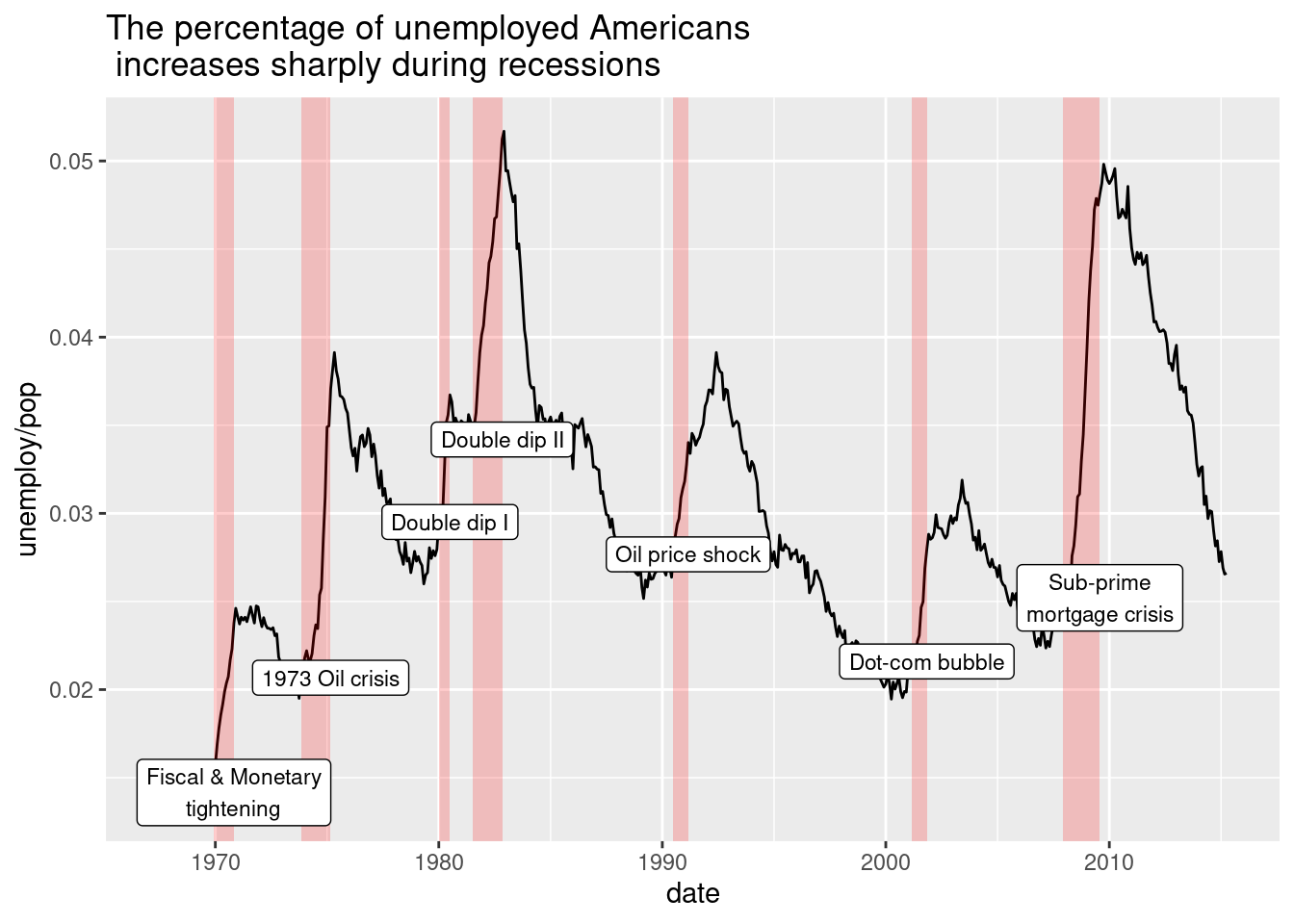
Next, we will update the plot to position the legend at the bottom of the plot.
# Position the legend at the bottom of the plot
plt_prop_unemployed_over_time +
  theme(legend.position = "bottom")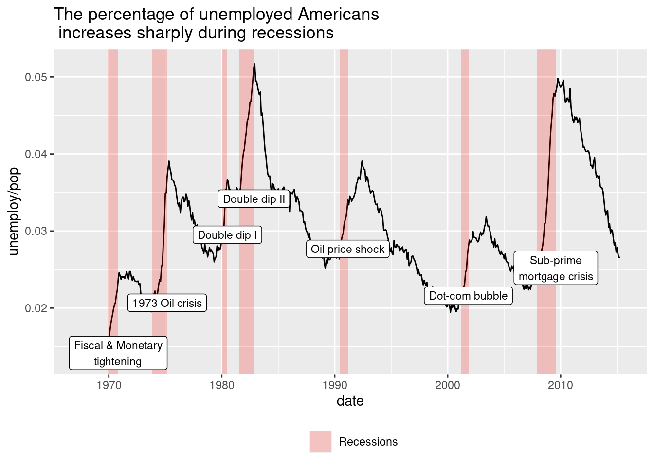
Finally we will position the legend inside the plot at (0.6, 0.1).
# Position the legend inside the plot at (0.6, 0.1)
plt_prop_unemployed_over_time +
  theme(legend.position = c(0.6, 0.1))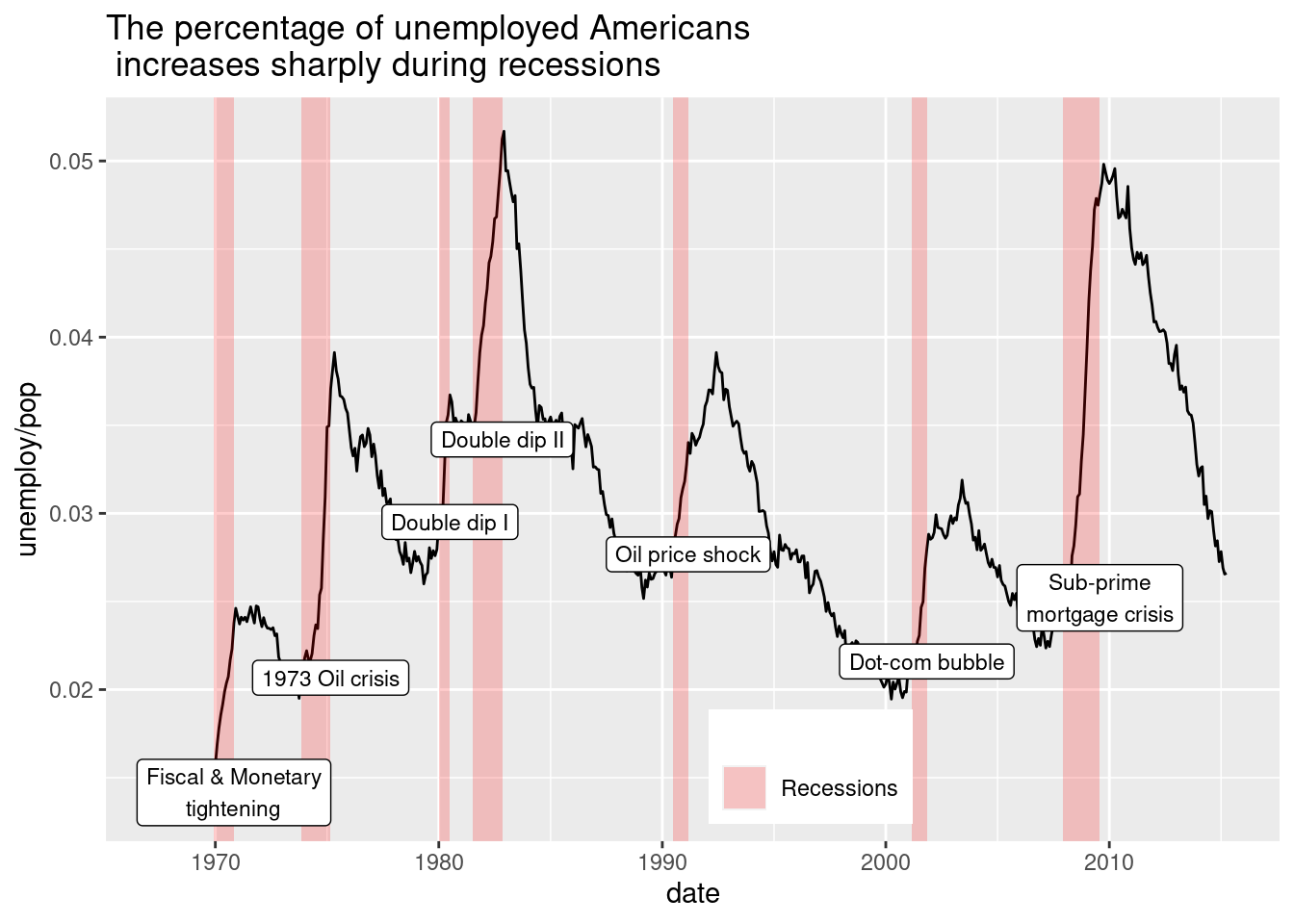
4.4.1.1 Modifying theme elements
Many plot elements have multiple properties that can be set. For example, line elements in the plot such as axes and gridlines have a color, a thickness (size), and a line type (solid line, dashed, or dotted). To set the style of a line, you use element_line(). For example, to make the axis lines into red, dashed lines, you would use the following. p + theme(axis.line = element_line(color = "red", linetype = "dashed")). Similarly, element_rect() changes rectangles and element_text() changes text. You can remove a plot element using element_blank().
In the first graph we will give all rectangles in the plot a fill color of “grey92” (very pale grey), and we will remove the legend key’s outline by setting its color to be missing.
plt_prop_unemployed_over_time +
  theme(
    # For all rectangles, set the fill color to grey92
    rect = element_rect(fill = "grey92"),
    # For the legend key, turn off the outline
legend.key = element_rect(color = NA)  )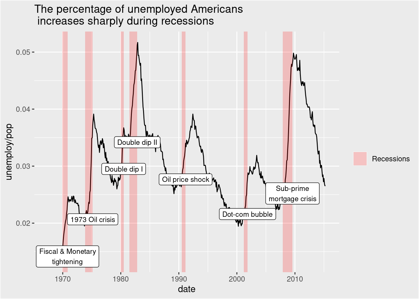
Next, we will remove the axis ticks by making them a blank element, and we will remove the panel gridlines in the same way.
plt_prop_unemployed_over_time +
  theme(
    rect = element_rect(fill = "grey92"),
    legend.key = element_rect(color = NA),
    # Turn off axis ticks
    axis.ticks = element_blank(),
    # Turn off the panel grid
    panel.grid = element_blank()
  )
Now we will Add the major horizontal grid lines back to the plot. We will also set the line color to “white”, size to 0.5, and linetype to “dotted”.
plt_prop_unemployed_over_time +
  theme(
    rect = element_rect(fill = "grey92"),
    legend.key = element_rect(color = NA),
    axis.ticks = element_blank(),
    panel.grid = element_blank(),
    # Add major y-axis panel grid lines back
    panel.grid.major.y = element_line(
      # Set the color to white
      color = "white",
      # Set the size to 0.5
      size = 0.5,
      # Set the line type to dotted
      linetype = "dotted"
    )
  )
## Warning: The `size` argument of `element_line()` is deprecated as of ggplot2 3.4.0.
## ℹ Please use the `linewidth` argument instead.
## This warning is displayed once every 8 hours.
## Call `lifecycle::last_lifecycle_warnings()` to see where this warning was
## generated.
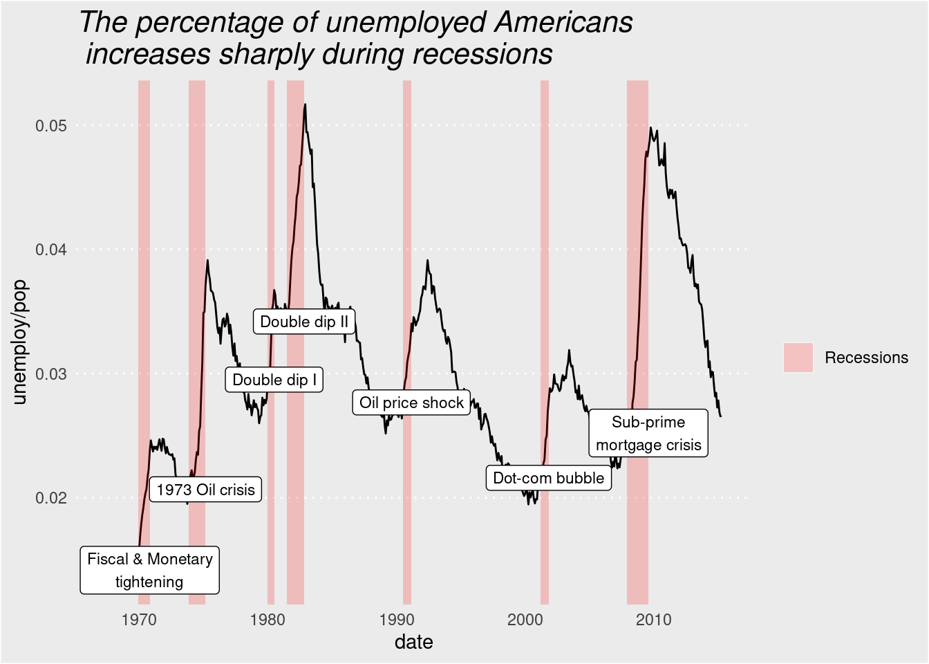
Finally, we will make the axis tick labels’ text, less prominent by changing the color to “grey25”. We will also increase the plot title’s, size to 16 and change its font face to “italic”.
plt_prop_unemployed_over_time +
  theme(rect = element_rect(fill = "grey92"),
    legend.key = element_rect(color = NA),
    axis.ticks = element_blank(),
    panel.grid = element_blank(),
    panel.grid.major.y = element_line(
      color = "white",
      size = 0.5,
      linetype = "dotted"
    ),
    # Set the axis text color to grey25
    axis.text = element_text(color = "grey25"),
    # Set the plot title font face to italic and font size to 16
   plot.title = element_text(size = 16, face = "italic")
  )
4.4.2 Modifying Whitespace
Whitespace means all the non-visible margins and spacing in the plot.To set a single whitespace value, use unit(x, unit), where x is the amount and unit is the unit of measure. Borders require you to set 4 positions, so use margin(top, right, bottom, left, unit). To remember the margin order, think TRouBLe. The default unit is "pt" (points), which scales well with text. Other options include “cm”, “in” (inches) and “lines” (of text).
First, we will give the axis tick length, a unit of 2 “lines”.
plt_mpg_vs_wt_by_cyl +
  theme(
    # Set the axis tick length to 2 lines
    axis.ticks.length = unit(2, "lines"))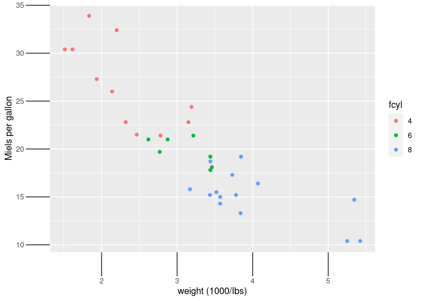
Next, we will give the legend key size, a unit of 3 centimeters ("cm").
plt_mpg_vs_wt_by_cyl +
  theme(
    # Set the legend key size to 3 centimeters
    legend.key.size = unit(3, "cm"))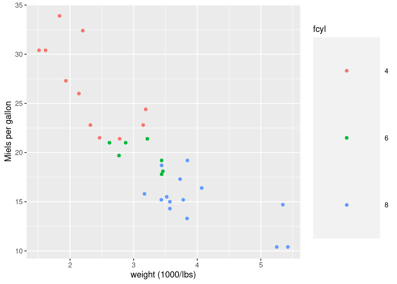
After that we will set the legend margin to 20 points ("pt") on the top, 30 pts on the right, 40 pts on the bottom, and 50 pts on the left.
plt_mpg_vs_wt_by_cyl +
  theme(
    # Set the legend margin to (20, 30, 40, 50) points
    legend.margin = margin(20, 30, 40, 50, "pt"))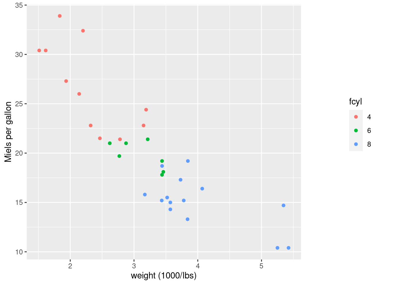
Last, we will Set the plot margin, to 10, 30, 50, and 70 millimeters ("mm").
plt_mpg_vs_wt_by_cyl +
  theme(
    # Set the plot margin to (10, 30, 50, 70) millimeters
    plot.margin = margin(10, 30, 50, 70, "mm"))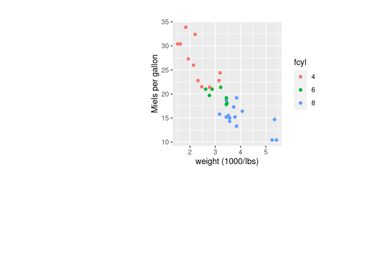
4.4.3 Built-in Themes
In addition to making your own themes, there are several out-of-the-box solutions that may save you lots of time.
theme_gray() is the default.
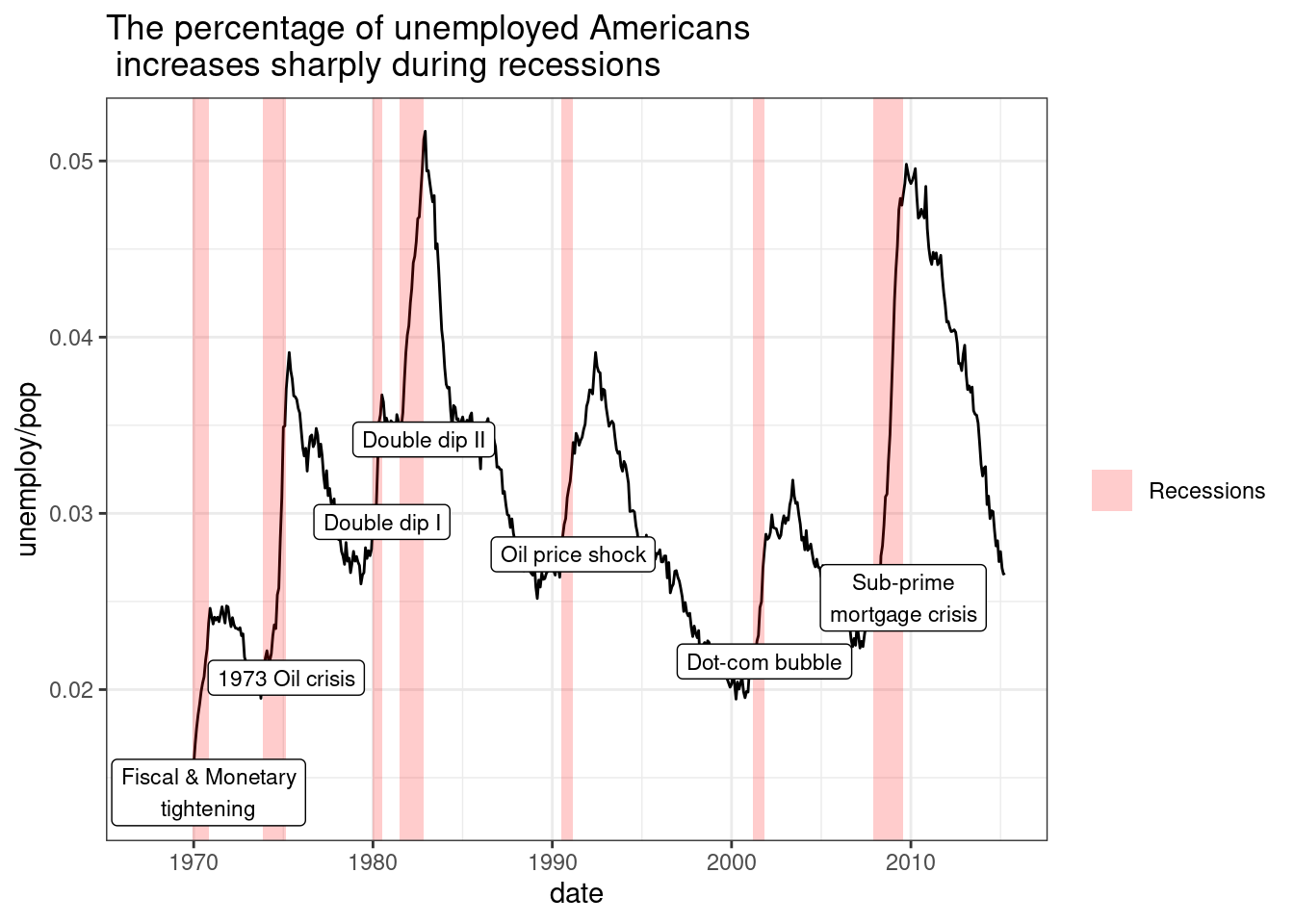
theme_bw() is useful when you use transparency.
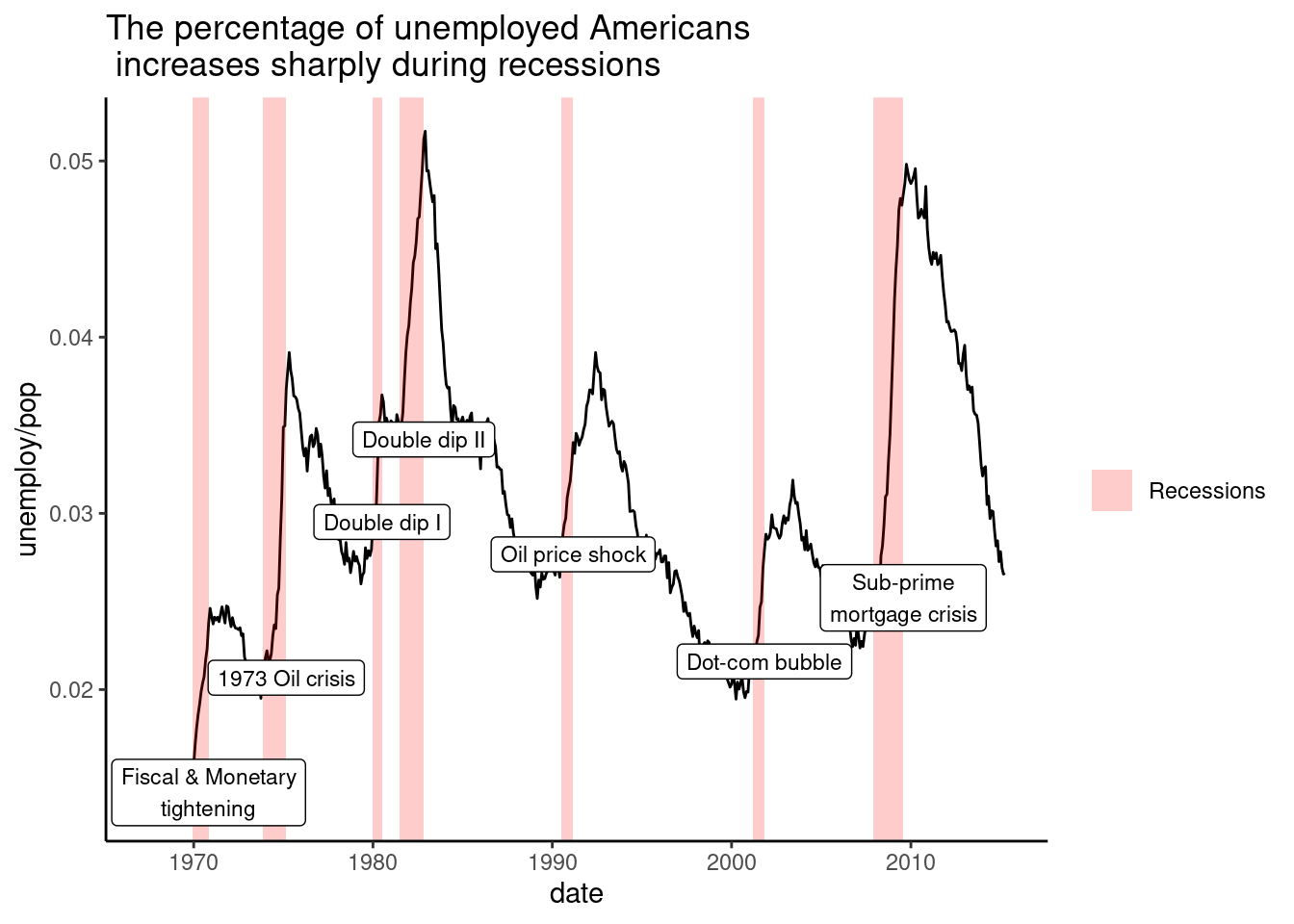
theme_classic() is more traditional.
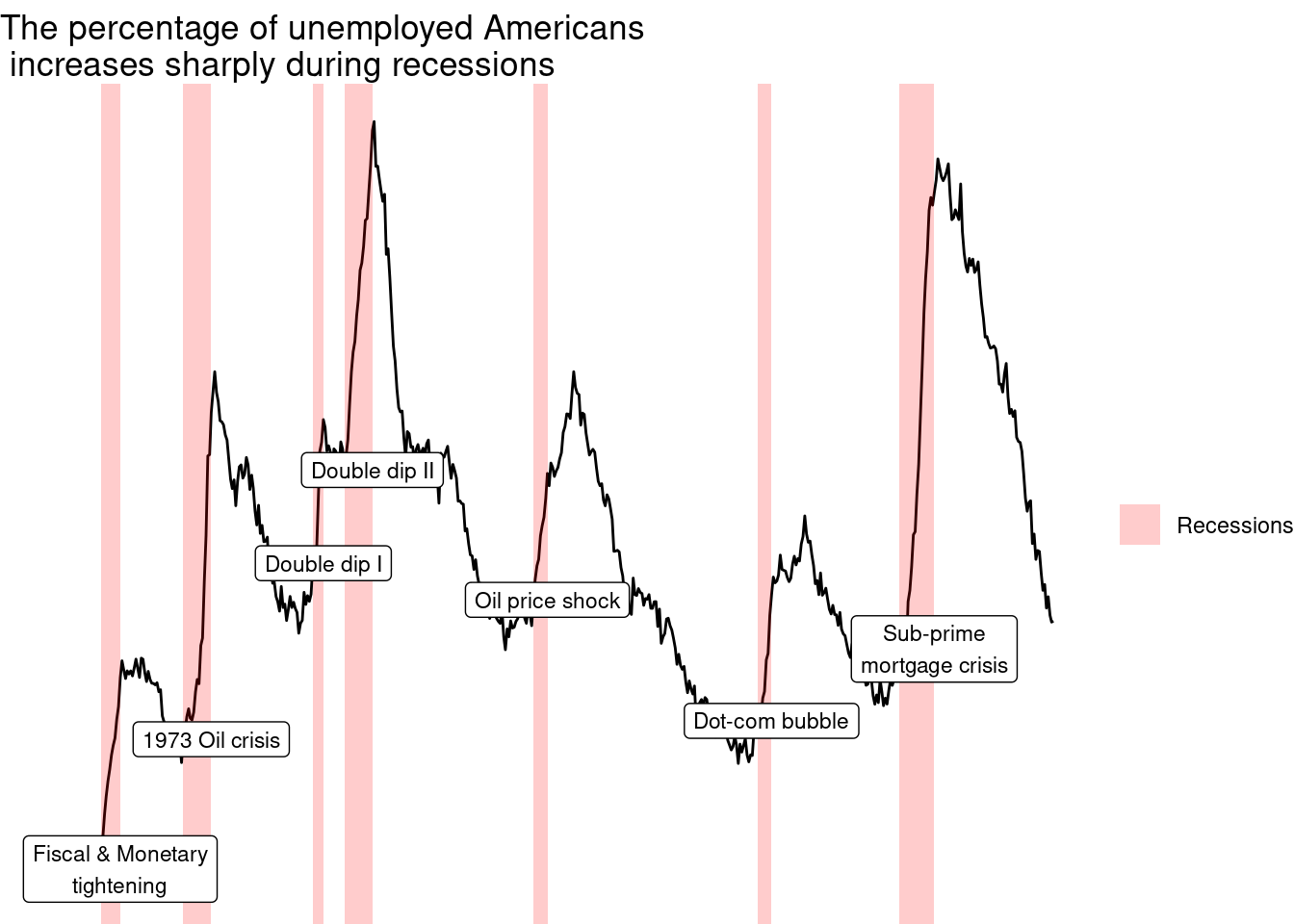
theme_void() removes everything but the data.
Add a black and white theme to the plot.
Add a classic theme to the plot.
Add a void theme to the plot
4.4.4 Exploring ggthemes
Outside of ggplot2, another source of built-in themes is the ggthemes package.
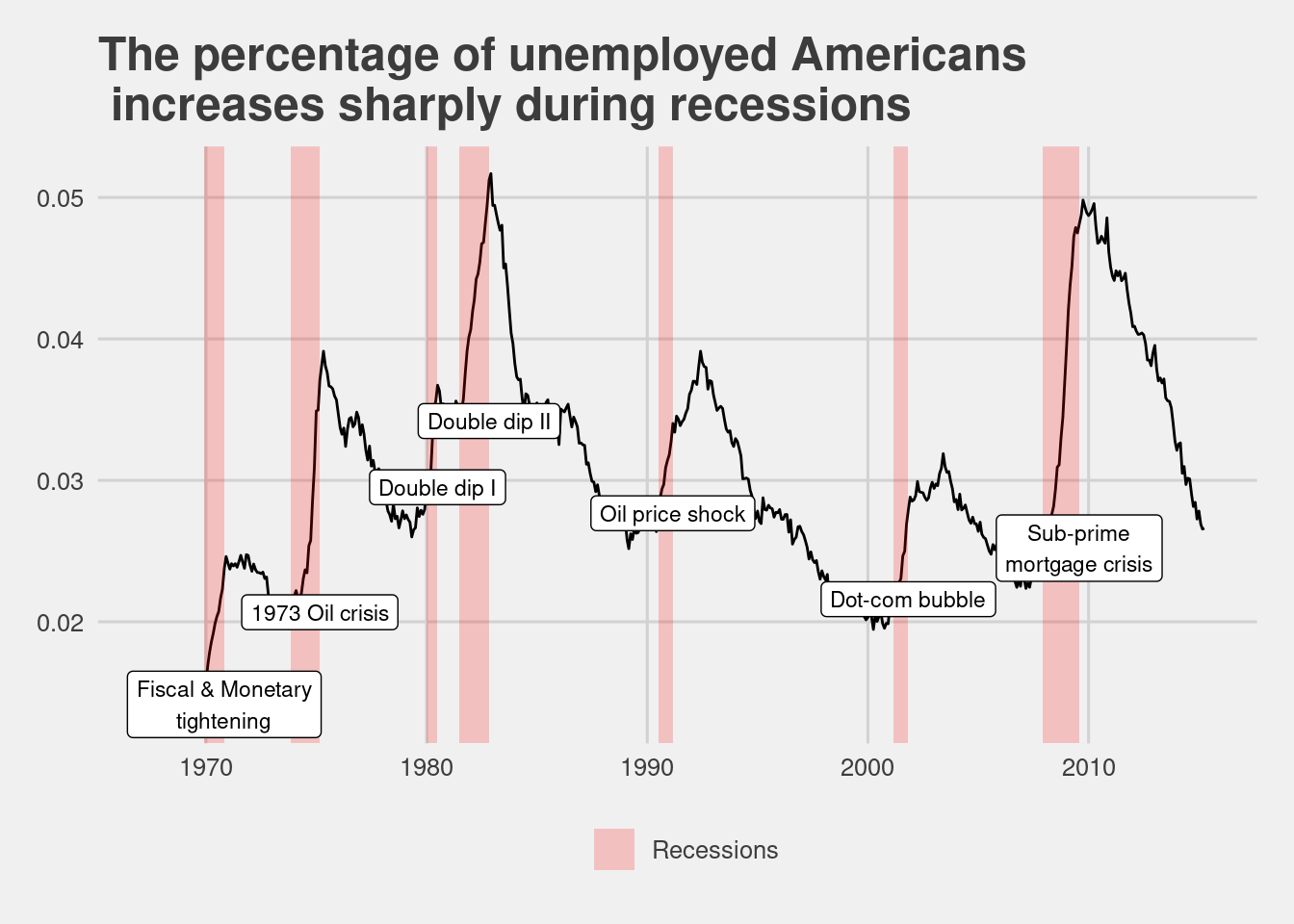
The first graph contains the 538 theme. This changes the font as well as making graph wider.
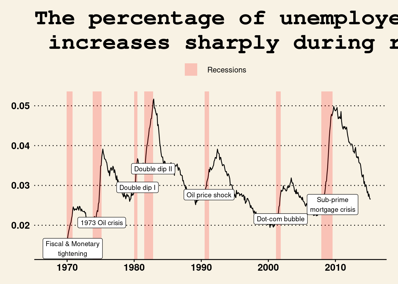
Next, we will add Tufte’s theme. This theme moved the legend to the side, along with a font change and removing the grid.

Last, we will try a Wall Street Journal theme. This moves the legend to the top, makes the background pink, and changes the font.
4.4.5 Setting themes
Reusing a theme across many plots helps to provide a consistent style. You have several options for this. Assign the theme to a variable, and add it to each plot. Set your theme as the default using theme_set(). A good strategy that you’ll use here is to begin with a built-in theme then modify it.
Below, we will Assign the theme to theme_recession. Add the Tufte theme and theme_recession together. Use the Tufte recession theme by adding it to the plot.
# Save the theme as theme_recession
theme_recession <- theme(
  rect = element_rect(fill = "grey92"),
  legend.key = element_rect(color = NA),
  axis.ticks = element_blank(),
  panel.grid = element_blank(),
  panel.grid.major.y = element_line(color = "white", size = 0.5, linetype = "dotted"),
  axis.text = element_text(color = "grey25"),
  plot.title = element_text(face = "italic", size = 16),
  legend.position = c(0.6, 0.1)
)

# Combine the Tufte theme with theme_recession
theme_tufte_recession <-   theme_tufte() + theme_recession

# Add the Tufte recession theme to the plot
plt_prop_unemployed_over_time + theme_tufte_recession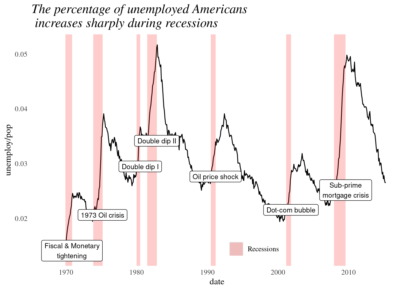
Now, we will use theme_set() to set theme_tufte_recession as the default theme. Draw the plot, plt_prop_unemployed_over_time, without explicitly adding a theme.
theme_recession <- theme(
  rect = element_rect(fill = "grey92"),
  legend.key = element_rect(color = NA),
  axis.ticks = element_blank(),
  panel.grid = element_blank(),
  panel.grid.major.y = element_line(color = "white", size = 0.5, linetype = "dotted"),
  axis.text = element_text(color = "grey25"),
  plot.title = element_text(face = "italic", size = 16),
  legend.position = c(0.6, 0.1)
)
theme_tufte_recession <- theme_tufte() + theme_recession

# Set theme_tufte_recession as the default theme
theme_set <- theme_tufte_recession

# Draw the plot (without explicitly adding a theme)
plt_prop_unemployed_over_time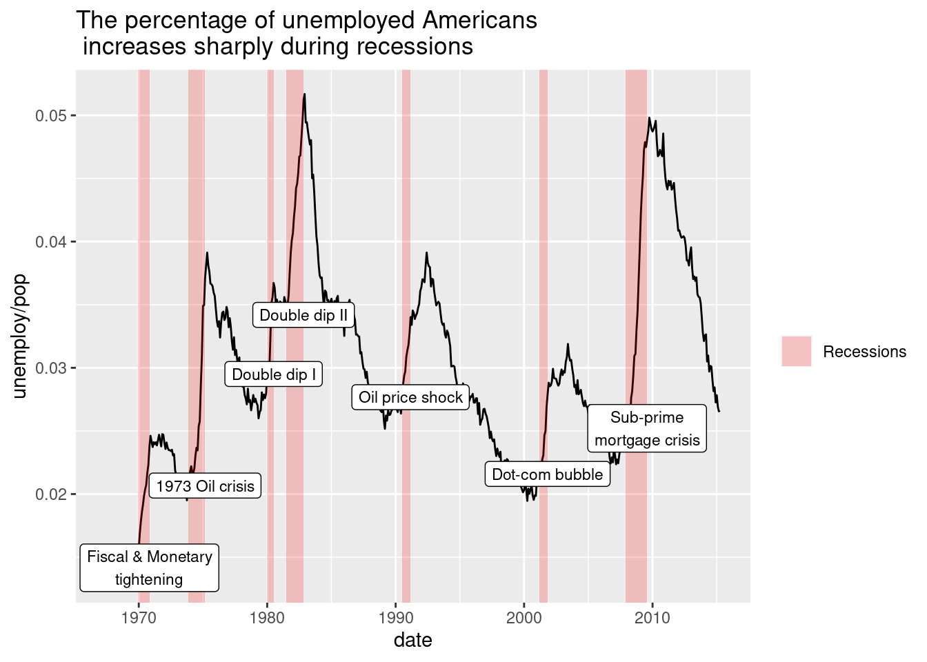
4.4.6 Publication-quality plots
We’ve seen many examples of beautiful, publication-quality plots. Let’s take a final look and put all the pieces together.
First, we will add tufte’s theme.
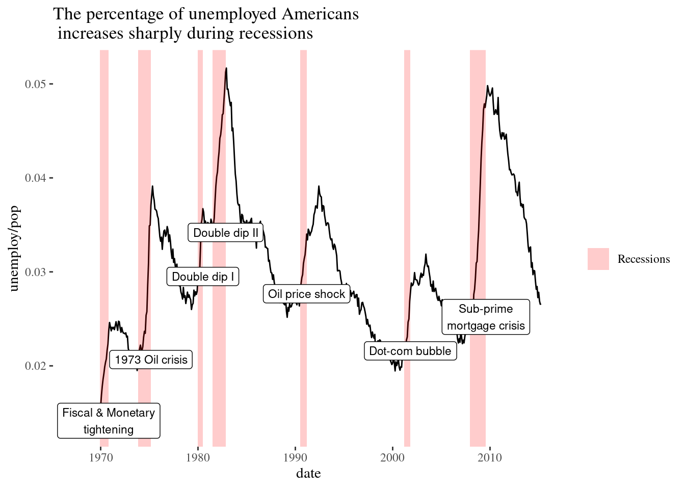
Next, we will call the function to add individual theme elements. Turn off the legend and the axis ticks.
plt_prop_unemployed_over_time +
  theme_tufte() +
  # Add individual theme elements
  theme(
    # Turn off the legend
    legend.position = "none",
    # Turn off the axis ticks
    axis.ticks = element_blank())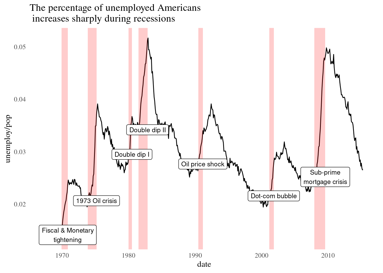
Set the axis title and axis text’s text color to grey60.
plt_prop_unemployed_over_time +
  theme_tufte() +
  theme(
    legend.position = "none",
    axis.ticks = element_blank(),
    # Set the axis title's text color to grey60
    axis.title = element_text(color = "grey60"),
    # Set the axis text's text color to grey60
    axis.text = element_text( color = "grey60"))
Last, we will set the panel gridlines major y values. Set the color to grey60, the size to 0.25, and the line type to dotted.
plt_prop_unemployed_over_time +
  theme_tufte() +
  theme(
    legend.position = "none",
    axis.ticks = element_blank(),
    axis.title = element_text(color = "grey60"),
    axis.text = element_text(color = "grey60"),
    # Set the panel gridlines major y values
    panel.grid.major.y = element_line(
      # Set the color to grey60
      color = "grey60",
      # Set the size to 0.25
      size = 0.25,
      # Set the linetype to dotted
      linetype = "dotted"))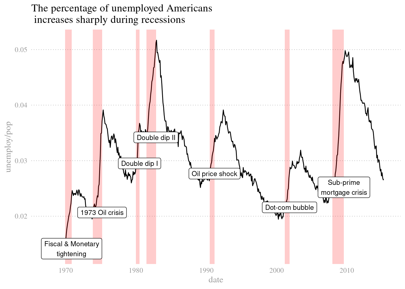
4.4.7 Using geoms for explanatory plots
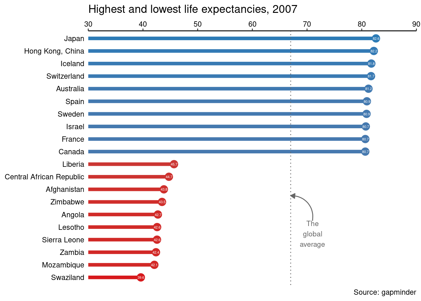
Let’s focus on producing beautiful and effective explanatory plots.This type of plot will be in an info-viz style, meaning that it would be similar to something you’d see in a magazine or website for a mostly lay audience.
first we will use geom_segment(), which adds line segments and requires two additional aesthetics: xend and yend. To draw a horizontal line for each point, map 30 onto xend and country onto yend. This goes inside the aes()
# Add a geom_segment() layer
ggplot(gm2007, aes(x = lifeExp, y = country, color = lifeExp)) +
  geom_point(size = 4) +
  geom_segment(aes(xend = 30, yend = country), size = 2)
## Warning: Using `size` aesthetic for lines was deprecated in ggplot2 3.4.0.
## ℹ Please use `linewidth` instead.
## This warning is displayed once every 8 hours.
## Call `lifecycle::last_lifecycle_warnings()` to see where this warning was
## generated.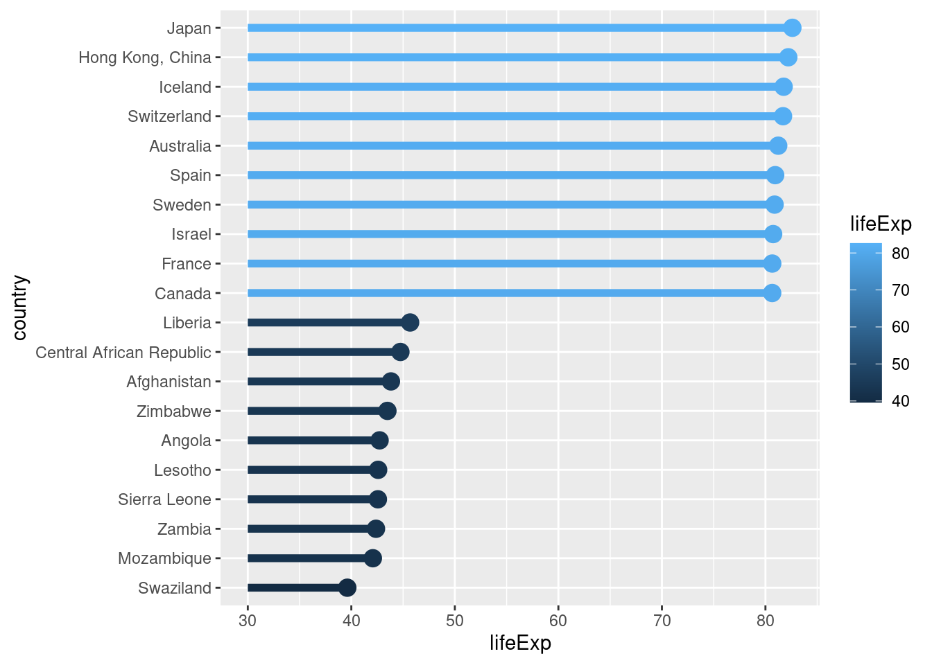
geom_text also needs an additional aesthetic: label. Map lifeExp onto label, and set the attributes color to "white" and size to 1.5.
# Add a geom_text() layer
ggplot(gm2007, aes(x = lifeExp, y = country, color = lifeExp)) +
  geom_point(size = 4) +
  geom_segment(aes(xend = 30, yend = country), size = 2) +
  geom_text(aes(label = lifeExp), color = "white", size = 1.5)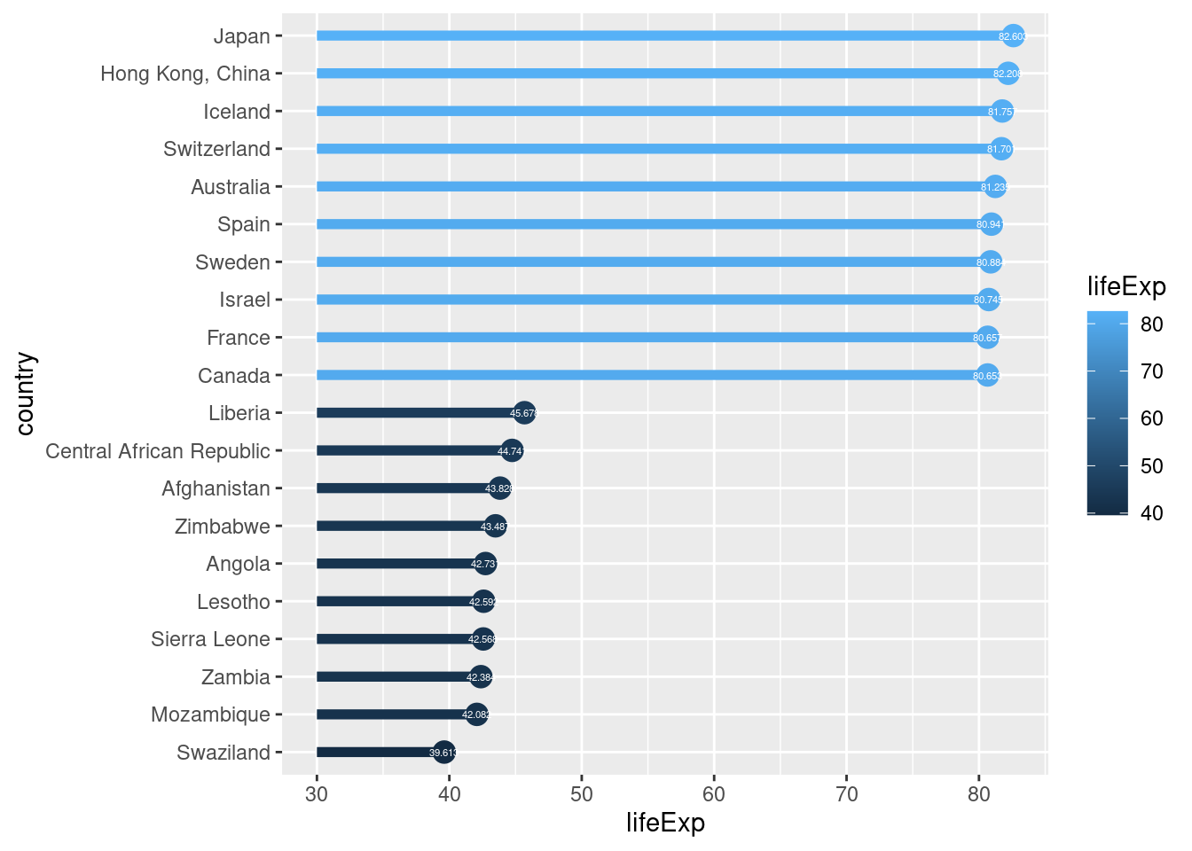
The color scale has been set for you, but you need to clean up the scales. For the x scale: Set expand to c(0, 0) and limits to c(30, 90). Place the axis on the top of the plot with the position argument.
# Set the color scale
palette <- brewer.pal(5, "RdYlBu")[-(2:4)]

# Modify the scales
ggplot(gm2007, aes(x = lifeExp, y = country, color = lifeExp)) +
  geom_point(size = 4) +
  geom_segment(aes(xend = 30, yend = country), size = 2) +
  geom_text(aes(label = round(lifeExp,1)), color = "white", size = 1.5) +
  scale_x_continuous("", expand = c(0,0), limits = c(30,90), position = "top") +
  scale_color_gradientn(colors = palette)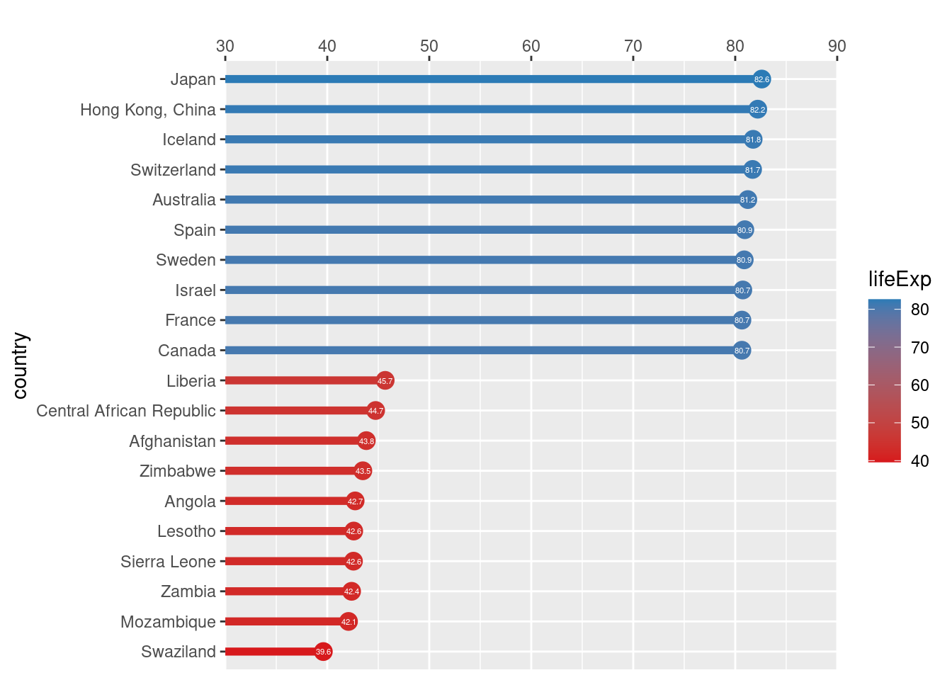
Make sure to label the plot appropriately using labs() :Make the title “Highest and lowest life expectancies, 2007”. Add a reference by setting caption to “Source: gapminder”.
# Set the color scale
palette <- brewer.pal(5, "RdYlBu")[-(2:4)]

# Add a title and caption
ggplot(gm2007, aes(x = lifeExp, y = country, color = lifeExp)) +
  geom_point(size = 4) +
  geom_segment(aes(xend = 30, yend = country), size = 2) +
  geom_text(aes(label = round(lifeExp,1)), color = "white", size = 1.5) +
  scale_x_continuous("", expand = c(0,0), limits = c(30,90), position = "top") +
  scale_color_gradientn(colors = palette) +
  labs(title="Highest and lowest life expectancies, 2007", caption = "Source: gapminder")
4.4.8 Using annotate() for embellishments
In the previous exercise, we completed our basic plot. Now let’s polish it by playing with the theme and adding annotations. In this exercise, you’ll use annotate() to add text and a curve to the plot.
to start, we will need to calculate these values for use later.
global_mean <- mean(gm2007_full$lifeExp)
x_start <- global_mean + 4
y_start <- 5.5
x_end <- global_mean
y_end <- 7.5
Below we will clean up the theme: Add a classic theme to the plot with theme_classic(). Set axis.line.y, axis.ticks.y, and axis.title to element_blank(). Set the axis.text color to "black". Remove the legend by setting legend.position to "none"
.
#Saving the prior graph for future use
plt_country_vs_lifeExp <- ggplot(gm2007, aes(x = lifeExp, y = country, color = lifeExp)) +
  geom_point(size = 4) +
  geom_segment(aes(xend = 30, yend = country), size = 2) +
  geom_text(aes(label = round(lifeExp,1)), color = "white", size = 1.5) +
  scale_x_continuous("", expand = c(0,0), limits = c(30,90), position = "top") +
  scale_color_gradientn(colors = palette) +
  labs(title="Highest and lowest life expectancies, 2007", caption = "Source: gapminder")


# Define the theme
plt_country_vs_lifeExp +
  theme_classic() +
  theme(axis.line.y = element_blank(),
        axis.ticks.y = element_blank(),
        axis.text = element_text(color = "black"),
        axis.title = element_blank(),
        legend.position = "none")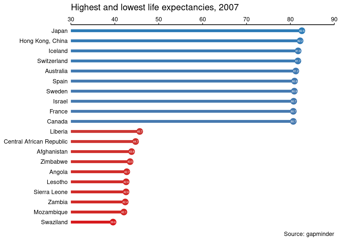
#save theme as a variable
step_1_themes <- theme_classic() +
  theme(axis.line.y = element_blank(),
        axis.ticks.y = element_blank(),
        axis.text = element_text(color = "black"),
        axis.title = element_blank(),
        legend.position = "none")
Next, use geom_vline() to add a vertical line. Set xintercept to global_mean, specify the color to be "grey40", and set linetype to 3.
# Add a vertical line
plt_country_vs_lifeExp +
  step_1_themes +
  geom_vline(xintercept = global_mean, color = "grey40", linetype=3)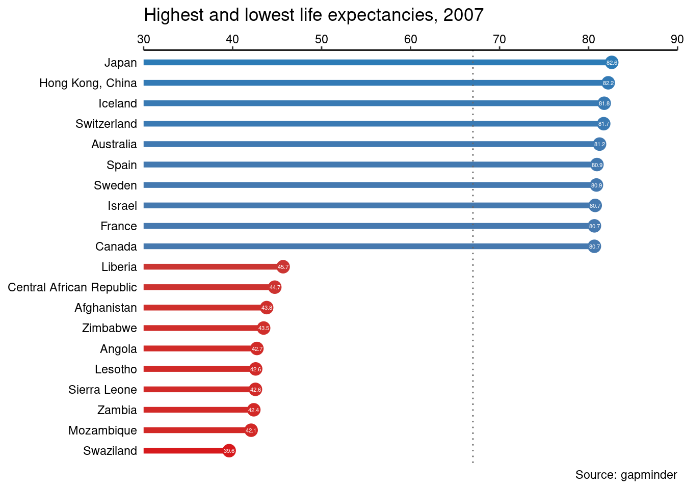
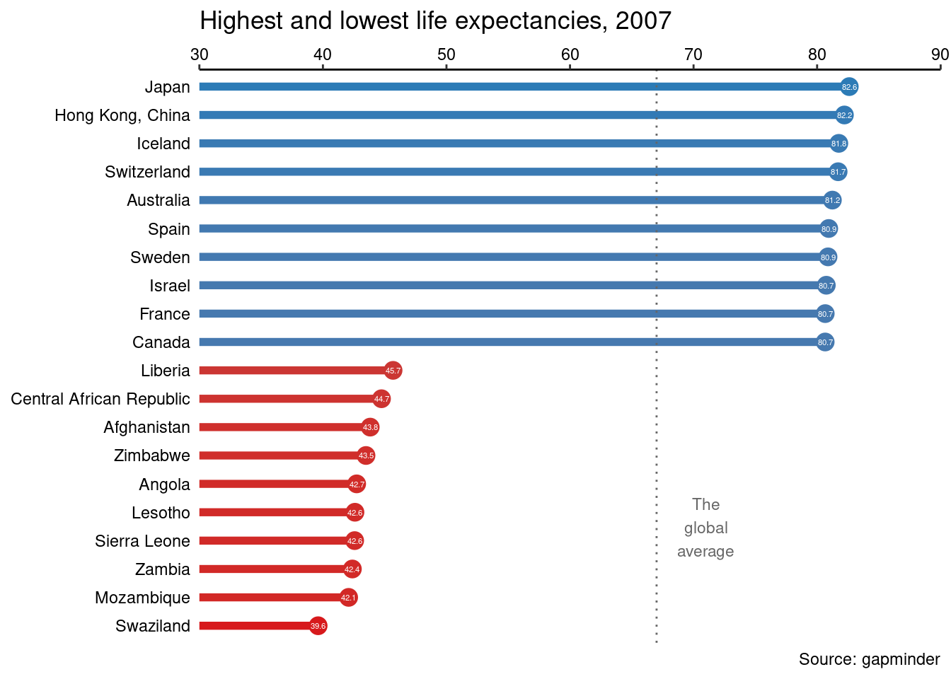
x_start and y_start will be used as positions to place text and have been calculated for you. Add a “text” geom as an annotation. For the annotation, set x to x_start, y to y_start, and label to "The\nglobal\naverage".
# Add text
plt_country_vs_lifeExp +
  step_1_themes +
  geom_vline(xintercept = global_mean, color = "grey40", linetype = 3) +
  annotate(
    "text",
    x = x_start, y = y_start,
    label = "The\nglobal\naverage",
    vjust = 1, size = 3, color = "grey40"
  )
Annotate the plot with an arrow connecting your text to the line. Use a "curve" geom. Set the arrow ends xend to x_end and yend to y_end. Set the length of the arrowhead to 0.2 cm and the type to "closed".
# Add a curve
plt_country_vs_lifeExp +
  step_1_themes +
  geom_vline(xintercept = global_mean, color = "grey40", linetype = 3) +
  annotate(
    "text",
    x = x_start, y = y_start,
    label = "The\nglobal\naverage",
    vjust = 1, size = 3, color = "grey40"
  ) +
  annotate(
    "curve",
    x = x_start, y = y_start,
    xend = x_end, yend = y_end,
    arrow = arrow(length = unit(0.2, "cm"), type = "closed"),
    color = "grey40"
  )